Do It Better Visually: Essential Presentation Design Tips

Generated from prompt:

do it better in visual

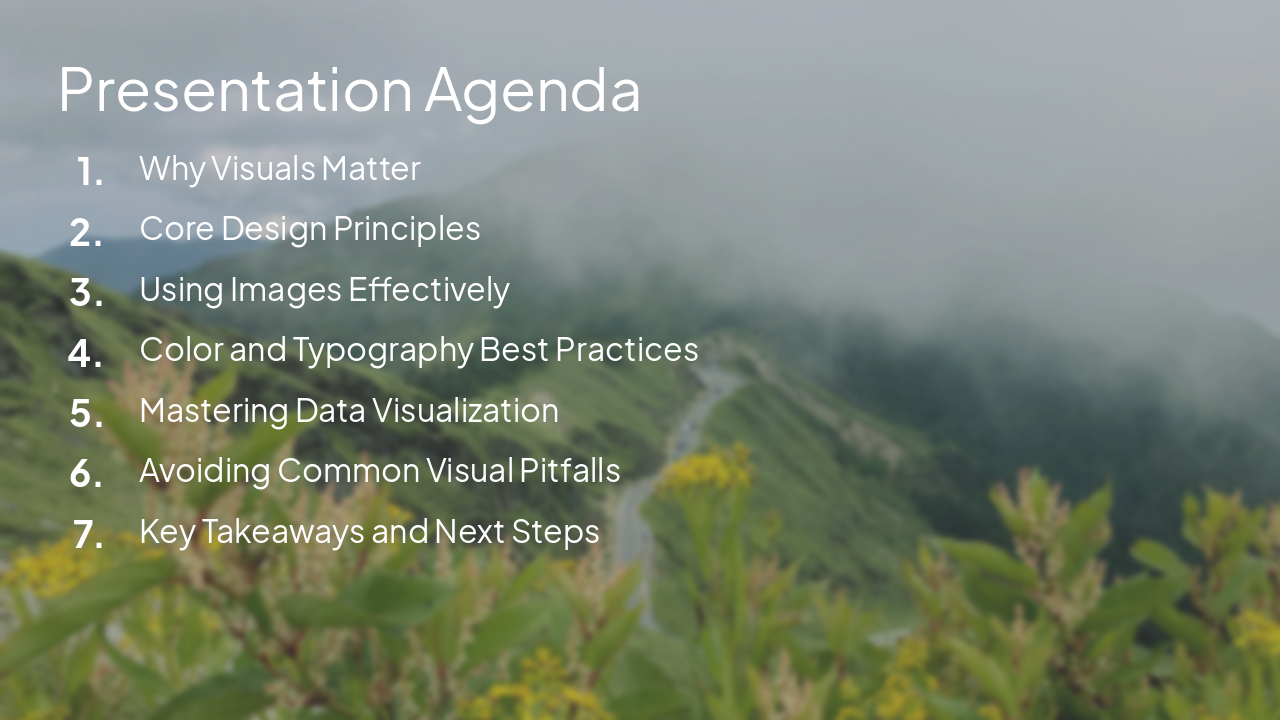
Discover why visuals matter and learn core principles for stunning presentations. Covers design basics, effective images, color & typography, data visualization, common pitfalls, and key takeaways to engage and persuade audiences.

May 5, 20269 slides
Slide 1 of 9

Slide 1 - Do It Better Visually

Do It Better Visually

Essential Tips for Creating Stunning Presentations

---

Photo by Fons Heijnsbroek on Unsplash

Slide 1 - Do It Better Visually
Slide 2 of 9

Slide 2 - Presentation Agenda

  • Why Visuals Matter
  • Core Design Principles
  • Using Images Effectively
  • Color and Typography Best Practices
  • Mastering Data Visualization
  • Avoiding Common Visual Pitfalls
  • Key Takeaways and Next Steps

---

Photo by Iren Liao on Unsplash

Slide 2 - Presentation Agenda
Slide 3 of 9

Slide 3 - Why Visuals Matter

  • 65%: Retention Rate
  • 400%: Understanding Boost
  • 90%: Brain Input
  • 43%: Persuasion Gain

---

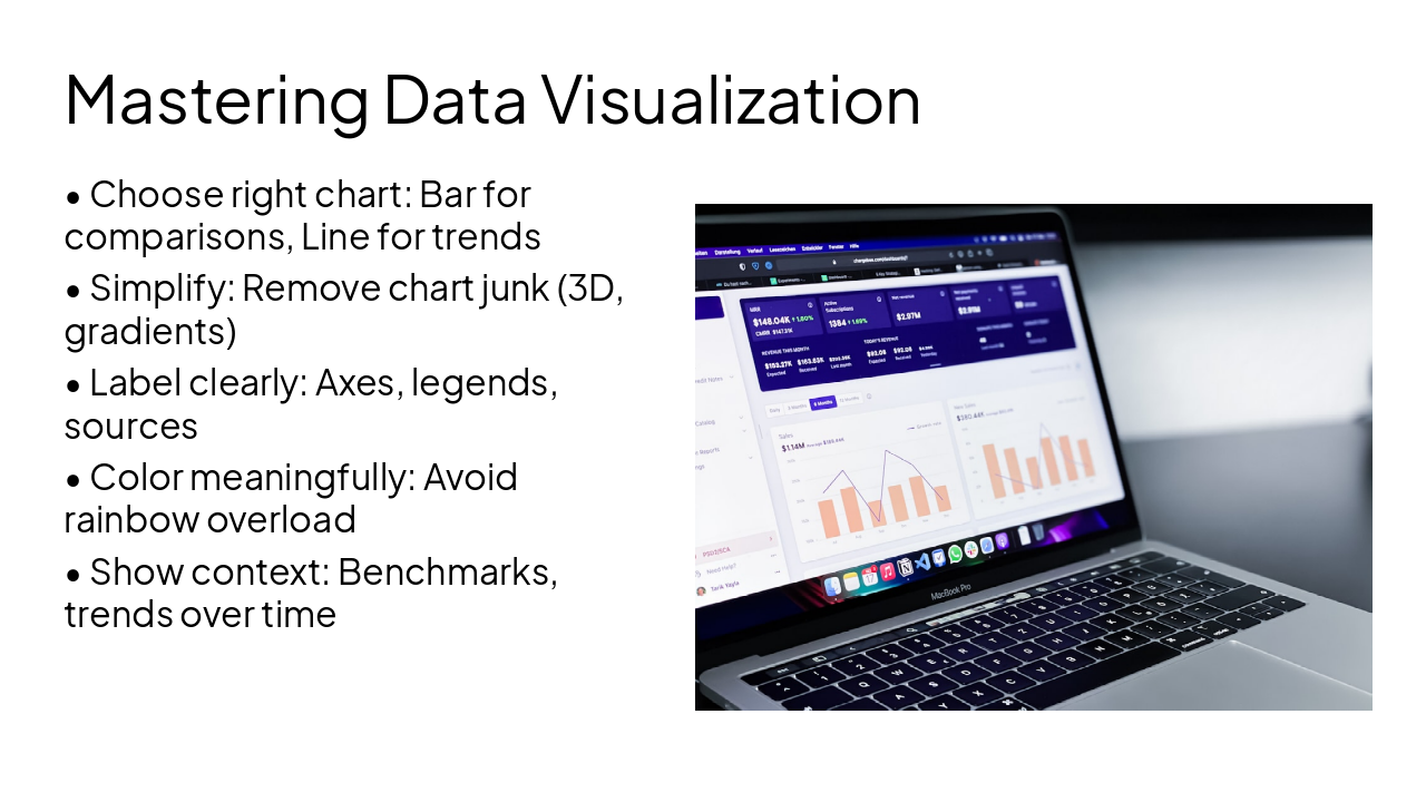
Photo by Hal Gatewood on Unsplash

Slide 3 - Why Visuals Matter
Slide 4 of 9

Slide 4 - Core Design Principles

  • Simplicity: Less is more - remove clutter
  • Consistency: Uniform fonts, colors, layouts
  • Visual Hierarchy: Use size, position to guide the eye
  • Contrast: High contrast for readability and emphasis
  • Alignment: Follow grids for clean look
  • Balance: Distribute elements evenly
Slide 4 - Core Design Principles
Slide 5 of 9

Slide 5 - Using Images Effectively

  • Choose high-resolution images (at least 1920x1080)
  • Ensure relevance - tie directly to message
  • Apply rule of thirds for composition
  • Credit sources if required
  • Avoid distractions: no watermarks or busy patterns

---

Photo by Kaleidico on Unsplash

Slide 5 - Using Images Effectively
Slide 6 of 9

Slide 6 - Color & Typography Best Practices

Color

  • Limit to 3-5 colors
  • Use color wheel for harmony
  • High contrast for accessibility (WCAG AA)
  • Brand consistency
  • Psychology: Blue=trust, Red=urgency

Typography

  • 2 fonts max (heading + body)
  • Sans-serif for screens (Arial, Helvetica)
  • Hierarchy: 24-48pt headings, 18-24pt body
  • 1.5-2x line spacing
  • Readability: 7-10 words per line
Slide 6 - Color & Typography Best Practices
Slide 7 of 9

Slide 7 - Mastering Data Visualization

  • Choose right chart: Bar for comparisons, Line for trends
  • Simplify: Remove chart junk (3D, gradients)
  • Label clearly: Axes, legends, sources
  • Color meaningfully: Avoid rainbow overload
  • Show context: Benchmarks, trends over time

---

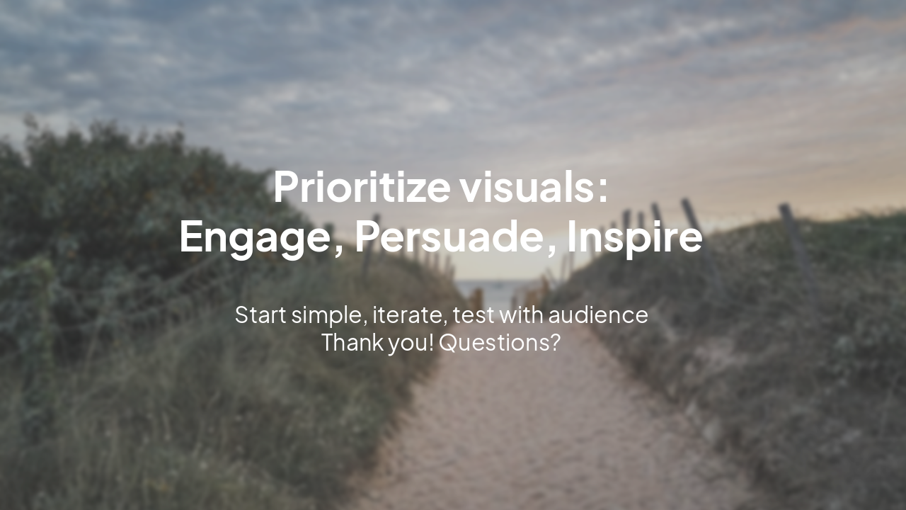
Photo by path digital on Unsplash

Slide 7 - Mastering Data Visualization
Slide 8 of 9

Slide 8 - Avoiding Common Visual Pitfalls

  • Death by Bullet Points: Limit to 5 lines max
  • Inconsistent Branding: Stick to style guide
  • Overuse of Animations: Use sparingly
  • Low-Resolution Assets: Always upscale
  • Clutter Overload: White space is your friend
  • Reading Slides: Speak to them, don't read
Slide 8 - Avoiding Common Visual Pitfalls
Slide 9 of 9

Slide 9 - Do It Better Visually

Prioritize visuals: Engage, Persuade, Inspire

Start simple, iterate, test with audience Thank you! Questions?

---

Photo by Florian Cordier on Unsplash

Slide 9 - Do It Better Visually

Discover More Presentations

Explore thousands of AI-generated presentations for inspiration

Browse Presentations
Powered by AI

Create Your Own Presentation

Generate professional presentations in seconds with Karaf's AI. Customize this presentation or start from scratch.

Create New Presentation

Powered by Karaf.ai — AI-Powered Presentation Generator