Slide 1 of 5
Slide 1 - Visual Cohesion and Design Update
Presentation Refinement Project
Refining visual cohesion and design consistency
---
Photo by Nastuh Abootalebi on Unsplash
Generated from prompt:
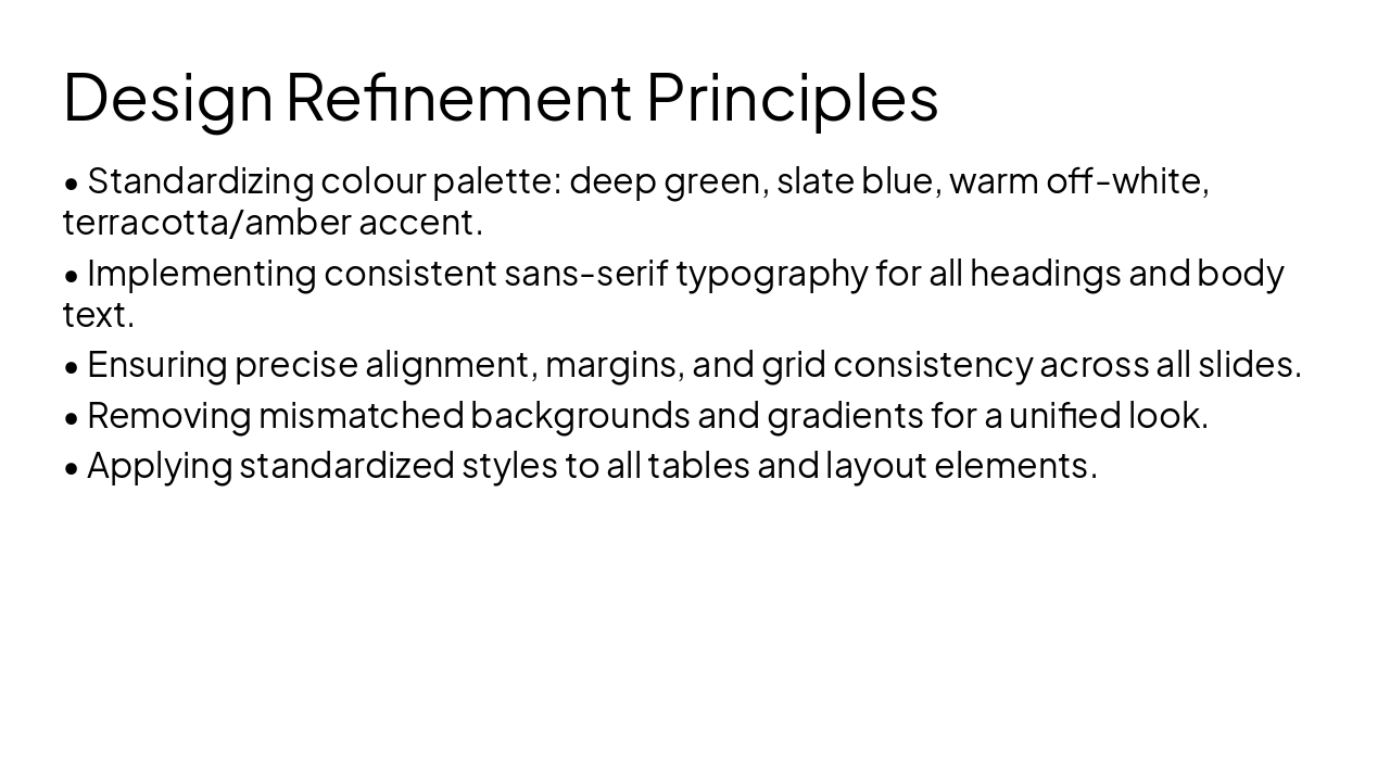
Refine the uploaded presentation for visual cohesion only. Do not move, replace, resize, or alter any images, maps, or diagrams. Keep all text exactly as written. Apply: - Consistent colour palette: deep green, slate blue, warm off-white, with terracotta/amber accent - Standardised fonts: bold sans-serif for headings, clean regular for body, consistent sizing - Precise alignment: consistent margins, spacing, grid alignment - Cohesive backgrounds: remove mismatched colours/gradients - Standardised tables/comparison layouts: same style, border weight, colour scheme - Add consistent section divider slides only if missing (no new content) Preserve all existing content and layout structure.
This deck details the refinement project for achieving visual cohesion in presentations, covering standardized color palettes (deep green, slate blue, warm off-white, terracotta accents), consistent sans-serif typography, precise alignment and grids,
Presentation Refinement Project
Refining visual cohesion and design consistency
---
Photo by Nastuh Abootalebi on Unsplash
1
Applying colour, typography, and alignment standards
---
Photo by Nastuh Abootalebi on Unsplash
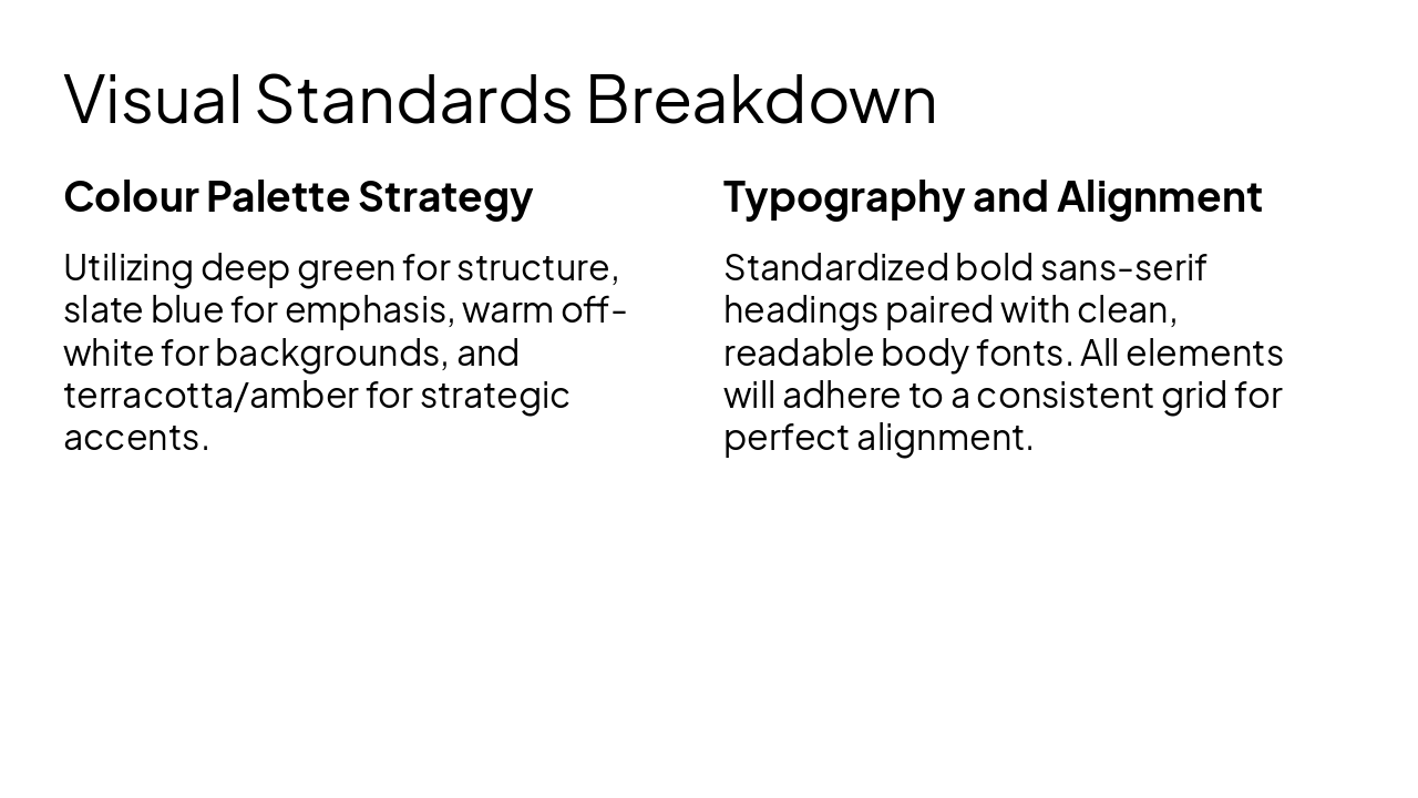
Colour Palette Strategy Utilizing deep green for structure, slate blue for emphasis, warm off-white for backgrounds, and terracotta/amber for strategic accents.
Typography and Alignment Standardized bold sans-serif headings paired with clean, readable body fonts. All elements will adhere to a consistent grid for perfect alignment.
The visual refinement process is complete.
Preserving all original content and structure.
Generating slide...
Explore thousands of AI-generated presentations for inspiration
Generate professional presentations in seconds with Karaf's AI. Customize this presentation or start from scratch.