Designing for Cognitive Clarity: Redesigning Craigslist
Generated from prompt:
Create a visually alluring, modern, high-contrast PowerPoint presentation titled "Designing for Cognitive Clarity" by Kamrunisha Ansari. Style Direction: - Minimalist, modern UI aesthetic - Strong visual hierarchy - Plenty of white space - Clean sans-serif typography - Soft neutral background with bold accent color (deep blue or violet) - Card-based layout inspiration - Subtle icons for Cognitive Load, Miller’s Law, Gestalt, Signal-to-Noise - Use visual comparisons (Before vs After) - Use large section dividers Slides Structure: 1. Cover Slide – Title + Subtitle + Name 2. Why This Interface? (Craigslist case study – cognitive issues overview) 3. Cognitive Load Identification (Intrinsic, Extraneous, Germane) 4. Miller’s Law Violation (visual explanation) 5. Cost of Clutter (table-style visual comparison) 6. Low-Fidelity Wireframes 7. High-Fidelity Wireframes 8. Redesign Overview (Before → After transformation) 9. What Changed (structured comparison slide) 10. Principles Applied (Cognitive Load Theory, Miller’s Law, Gestalt, Signal-to-Noise) 11. How Cognitive Load Was Reduced 12. Final Visual Redesign Showcase 13. Thank You Slide (clean, minimal) Make it highly visual, reduce text density, convert bullet lists into visual blocks, comparison layouts, and clean spacing.
This presentation critiques Craigslist's cognitively overwhelming interface, identifies issues like information overload and poor hierarchy violating Miller's Law, and showcases a redesigned version applying Cognitive Load Theory, Gestalt principles,

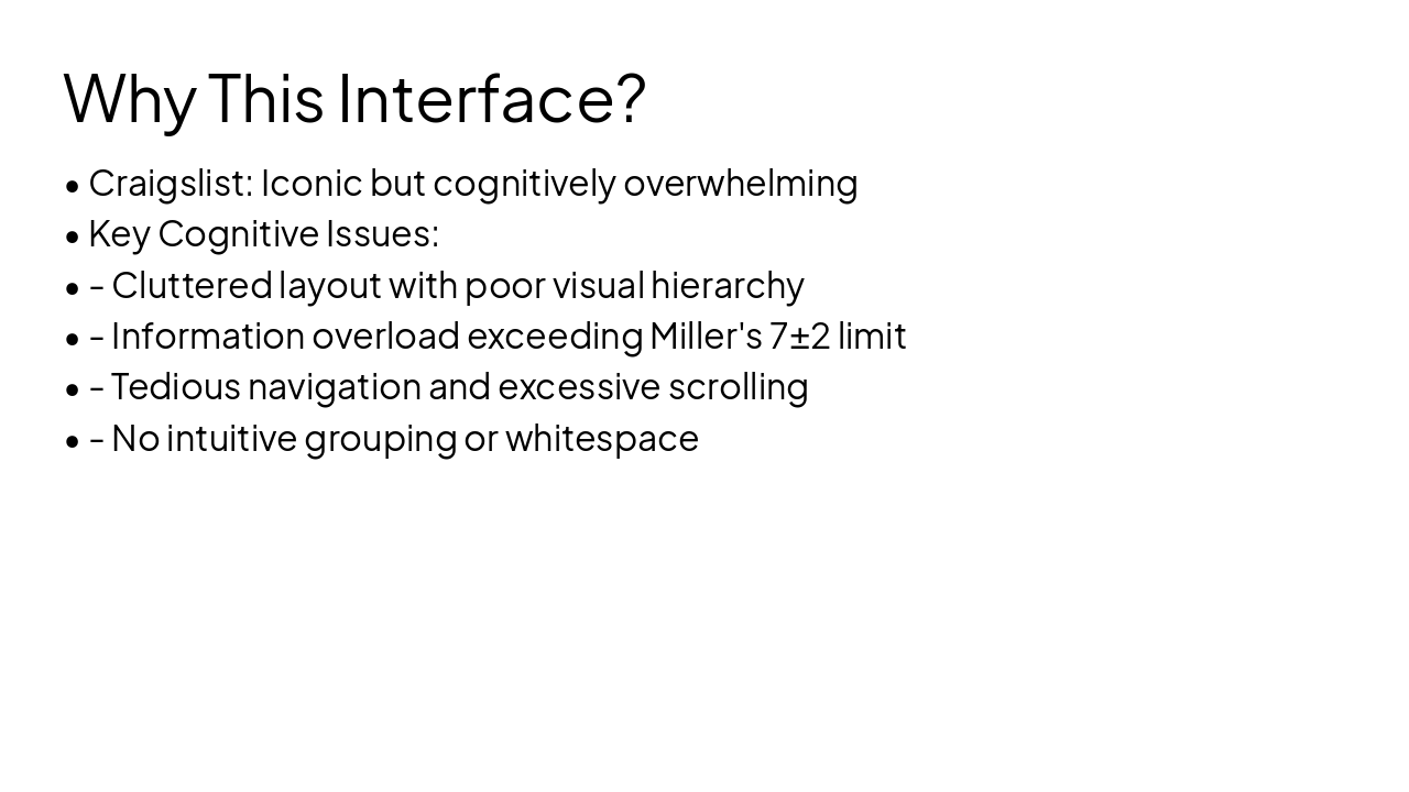
Slide 2 - Why This Interface?
- Craigslist: Iconic but cognitively overwhelming
- Key Cognitive Issues:
- - Cluttered layout with poor visual hierarchy
- - Information overload exceeding Miller's 7±2 limit
- - Tedious navigation and excessive scrolling
- - No intuitive grouping or whitespace
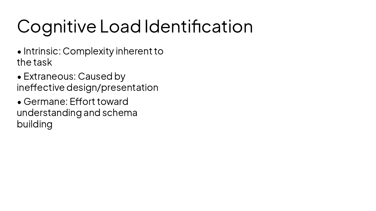
Slide 3 - Cognitive Load Identification
- Intrinsic: Complexity inherent to the task
- Extraneous: Caused by ineffective design/presentation
- Germane: Effort toward understanding and schema building
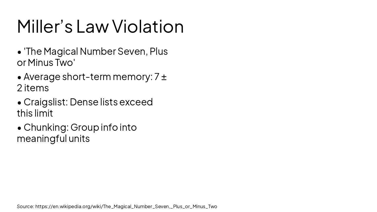
Slide 4 - Miller’s Law Violation
- 'The Magical Number Seven, Plus or Minus Two'
- Average short-term memory: 7 ± 2 items
- Craigslist: Dense lists exceed this limit
- Chunking: Group info into meaningful units
Source: https://en.wikipedia.org/wiki/The_Magical_Number_Seven,_Plus_or_Minus_Two
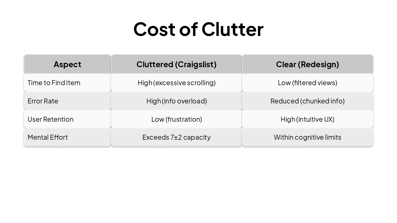
Slide 5 - Cost of Clutter
| Aspect | Cluttered (Craigslist) | Clear (Redesign) |
|---|---|---|
| Time to Find Item | High (excessive scrolling) | Low (filtered views) |
| Error Rate | High (info overload) | Reduced (chunked info) |
| User Retention | Low (frustration) | High (intuitive UX) |
| Mental Effort | Exceeds 7±2 capacity | Within cognitive limits |
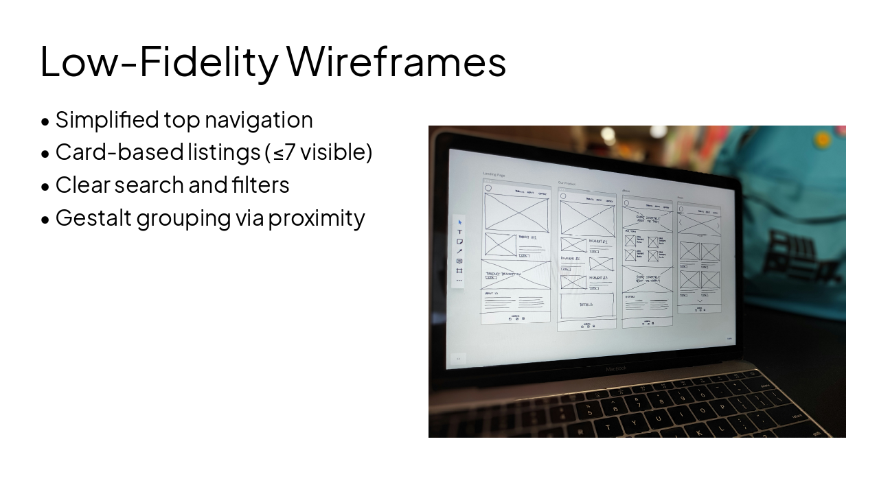
Slide 6 - Low-Fidelity Wireframes
- Simplified top navigation
- Card-based listings (≤7 visible)
- Clear search and filters
- Gestalt grouping via proximity
---
Photo by Amper on Unsplash
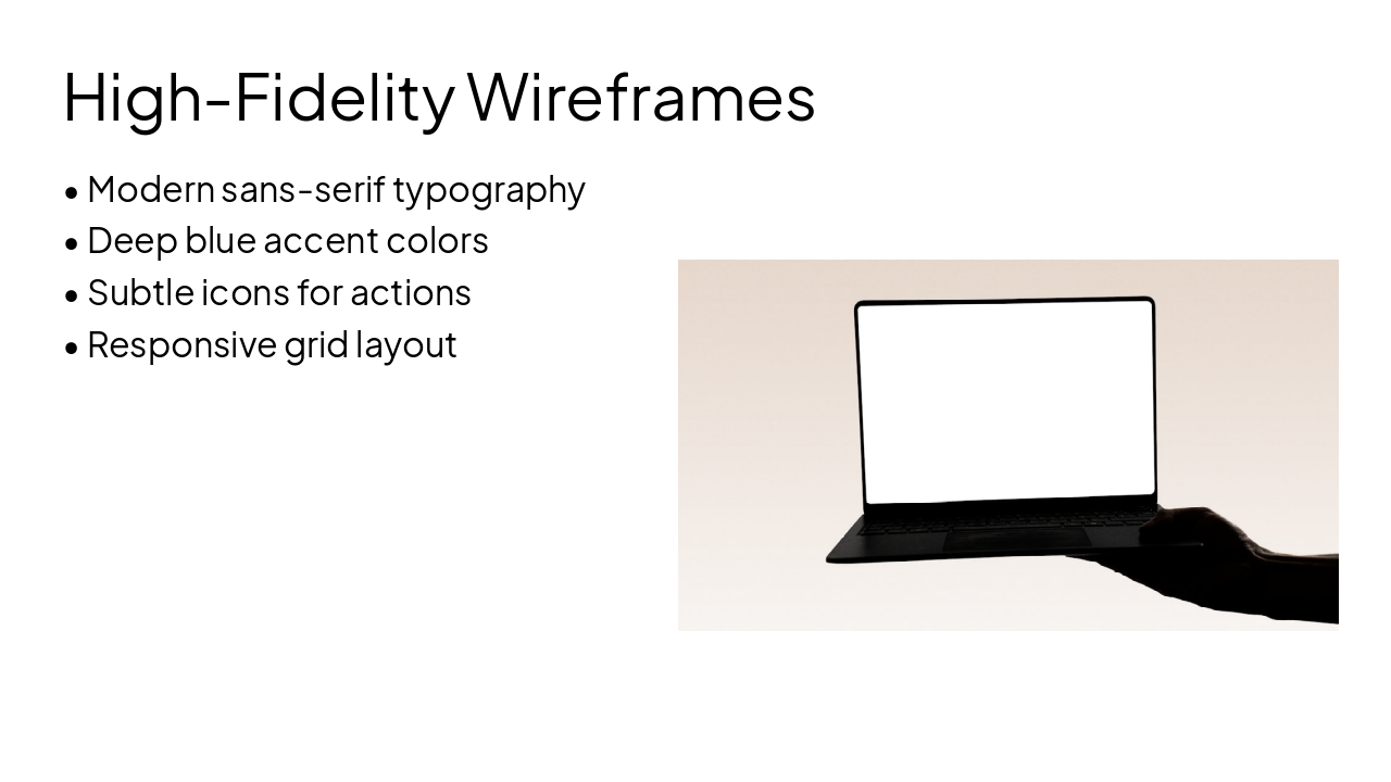
Slide 7 - High-Fidelity Wireframes
- Modern sans-serif typography
- Deep blue accent colors
- Subtle icons for actions
- Responsive grid layout
---
Photo by Lorin Both on Unsplash
Slide 8 - Redesign Overview
Before (Original) Dense walls of text No visual separation Overwhelming info density Poor scannability
After (Redesign) Chunked card layouts Ample white space Bold hierarchy Easy scannability
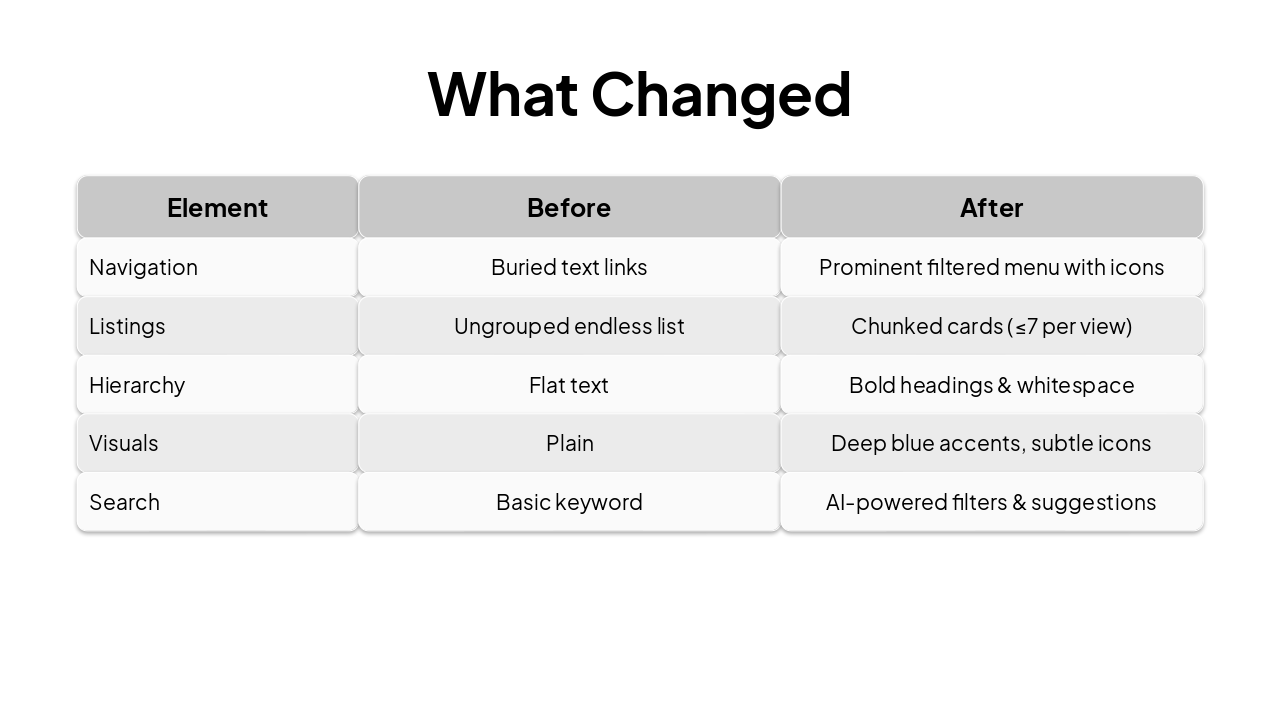
Slide 9 - What Changed
| Element | Before | After |
|---|---|---|
| Navigation | Buried text links | Prominent filtered menu with icons |
| Listings | Ungrouped endless list | Chunked cards (≤7 per view) |
| Hierarchy | Flat text | Bold headings & whitespace |
| Visuals | Plain | Deep blue accents, subtle icons |
| Search | Basic keyword | AI-powered filters & suggestions |
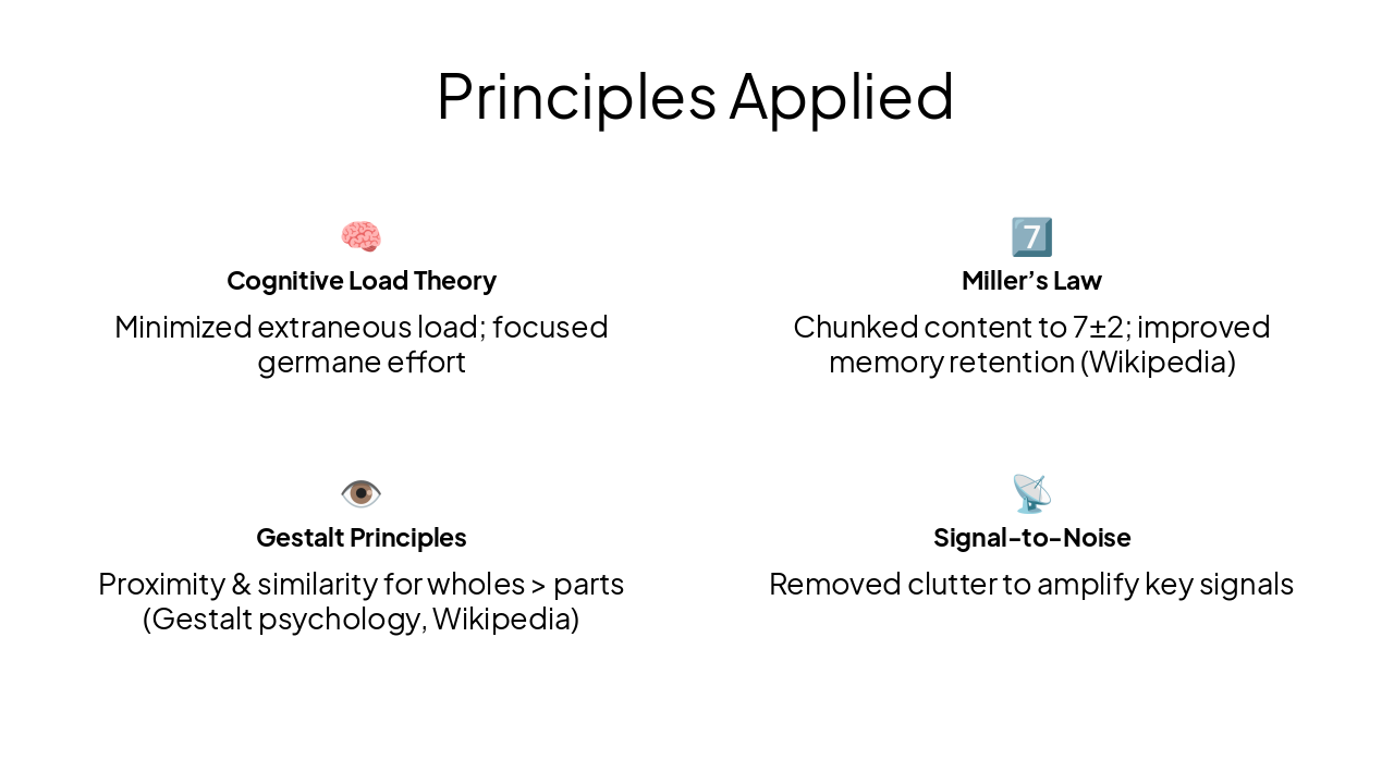
Slide 10 - Principles Applied
🧠 Cognitive Load Theory Minimized extraneous load; focused germane effort
7️⃣ Miller’s Law Chunked content to 7±2; improved memory retention (Wikipedia)
👁️ Gestalt Principles Proximity & similarity for wholes > parts (Gestalt psychology, Wikipedia)
📡 Signal-to-Noise Removed clutter to amplify key signals
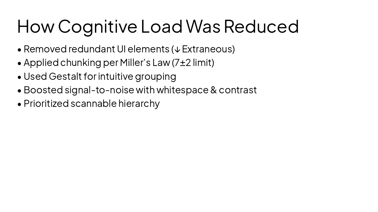
Slide 11 - How Cognitive Load Was Reduced
- Removed redundant UI elements (↓ Extraneous)
- Applied chunking per Miller’s Law (7±2 limit)
- Used Gestalt for intuitive grouping
- Boosted signal-to-noise with whitespace & contrast
- Prioritized scannable hierarchy
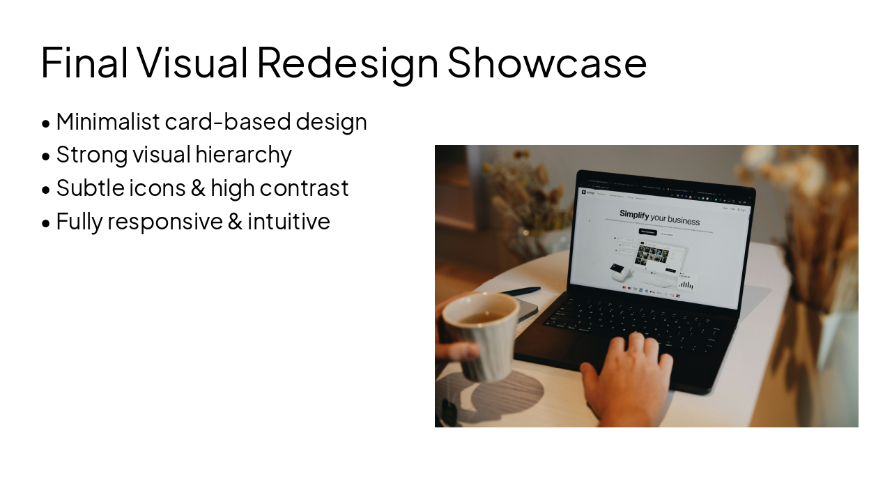
Slide 12 - Final Visual Redesign Showcase
- Minimalist card-based design
- Strong visual hierarchy
- Subtle icons & high contrast
- Fully responsive & intuitive
---
Photo by SumUp on Unsplash
Slide 13 - Thank You
Thank You for Your Attention
Kamrunisha Ansari Redesigning for Cognitive Clarity
---
Photo by Malumo on Unsplash

Discover More Presentations
Explore thousands of AI-generated presentations for inspiration
Create Your Own Presentation
Generate professional presentations in seconds with Karaf's AI. Customize this presentation or start from scratch.