Slide 1 of 30
Slide 1 - Introducción al Excel para Estudiantes de Ingeniería

Generated from prompt:
por favor diseñarme la presentación en 30 diapositivas aproximadamente sobre: Titulo: introduccion al excel para estudiantes de ingenieria TEMAS: Tema 1: Introducción a Microsoft Excel y su entorno Tema 2: Operaciones básicas y formato de celdas Tema 3: Uso de funciones básicas y fórmulas útiles Tema 4: Representación gráfica de datos Tema 5: Aplicaciones prácticas de Excel en la vida estudiantil de ingeniería es para un nivel de estudiantes de 5to de secundaria
This 30-slide presentation introduces Microsoft Excel to 5th-year high school engineering students, covering basics like interface navigation, cell operations and formatting, essential functions and f
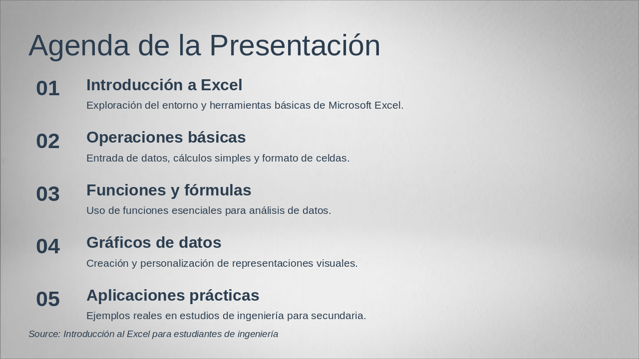
The presentation agenda outlines an introduction to Microsoft Excel, covering exploration of its basic environment and tools. It then progresses through fundamental operations like data entry and cell formatting, essential functions for data analysis, creating customizable charts, and practical engineering examples for high school students.
Exploración del entorno y herramientas básicas de Microsoft Excel.
Entrada de datos, cálculos simples y formato de celdas.
Uso de funciones esenciales para análisis de datos.
Creación y personalización de representaciones visuales.
Ejemplos reales en estudios de ingeniería para secundaria. Source: Introducción al Excel para estudiantes de ingeniería
This section header slide introduces Microsoft Excel and its basic environment, tailored for engineering students. It highlights discovering the interface and essential tools to prepare future engineers for practical use.
01
Descubriendo la interfaz y entorno básico de Excel para futuros ingenieros

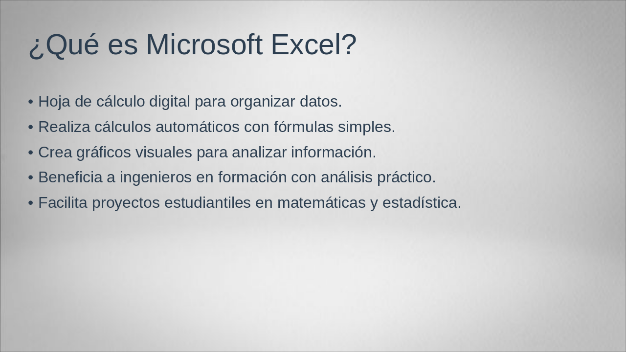
Microsoft Excel is a digital spreadsheet tool designed for organizing data, performing automatic calculations with simple formulas, and creating visual charts to analyze information. It particularly benefits engineering students through practical analysis and supports academic projects in mathematics and statistics.
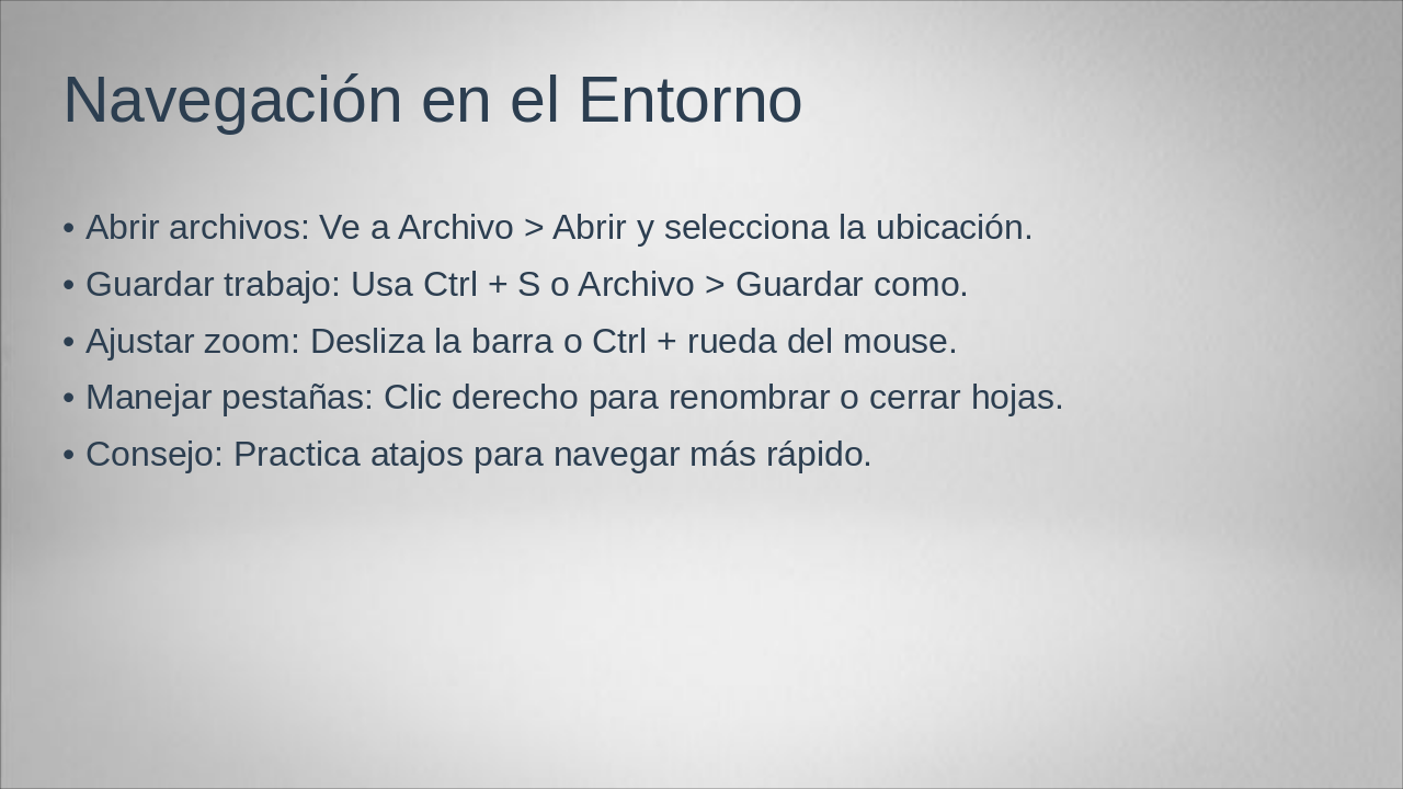
This slide outlines basic navigation in the environment, including opening files via File > Open, saving work with Ctrl + S or File > Save As, adjusting zoom with the slider or Ctrl + mouse wheel, and managing tabs by right-clicking to rename or close sheets. It also offers a tip to practice keyboard shortcuts for faster navigation.
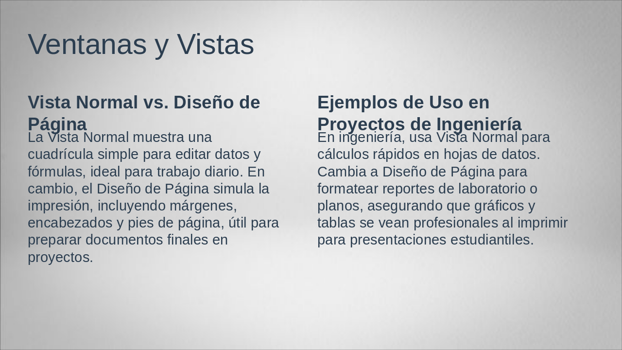
The slide "Ventanas y Vistas" contrasts the Normal View, a simple grid for daily editing of data and formulas, with Page Layout View, which simulates printing by including margins, headers, and footers for final document preparation in projects. It provides engineering project examples, such as using Normal View for quick data calculations and switching to Page Layout for professionally formatting lab reports, plans, graphs, and tables for student presentations.
| Vista Normal vs. Diseño de Página | Ejemplos de Uso en Proyectos de Ingeniería |
|---|---|
| La Vista Normal muestra una cuadrícula simple para editar datos y fórmulas, ideal para trabajo diario. En cambio, el Diseño de Página simula la impresión, incluyendo márgenes, encabezados y pies de página, útil para preparar documentos finales en proyectos. | En ingeniería, usa Vista Normal para cálculos rápidos en hojas de datos. Cambia a Diseño de Página para formatear reportes de laboratorio o planos, asegurando que gráficos y tablas se vean profesionales al imprimir para presentaciones estudiantiles. |
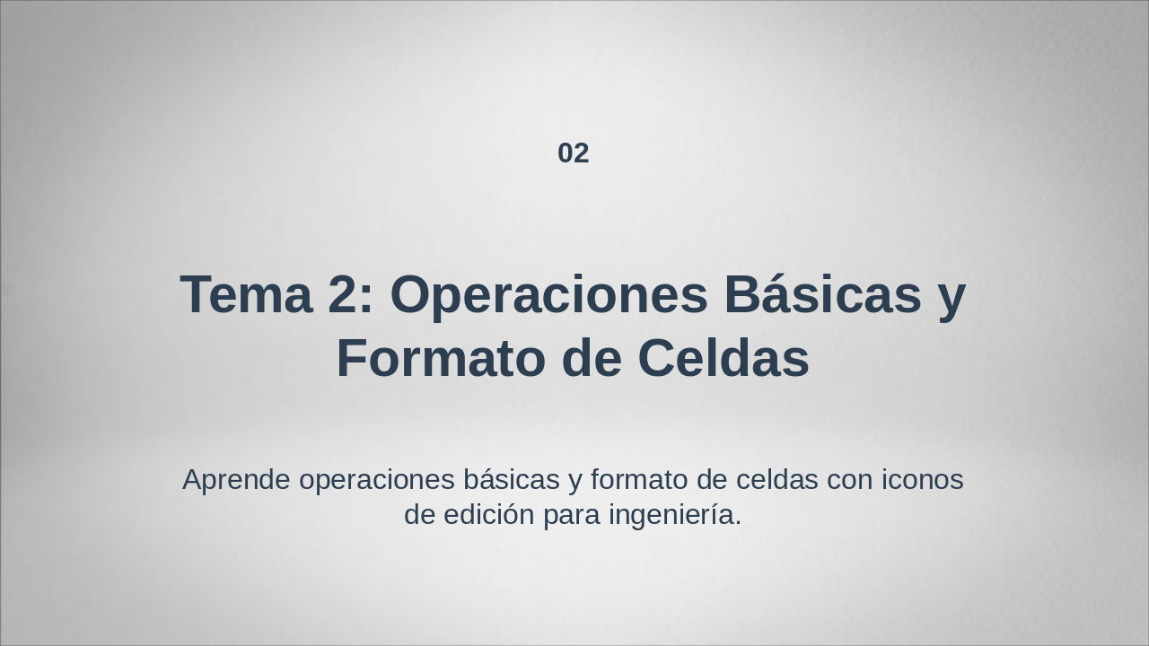
This section header slide introduces "Tema 2: Operaciones Básicas y Formato de Celdas," marking it as the second topic in a series. It features a subtitle emphasizing learning basic operations and cell formatting through editing icons tailored for engineering applications.
02
Aprende operaciones básicas y formato de celdas con iconos de edición para ingeniería.
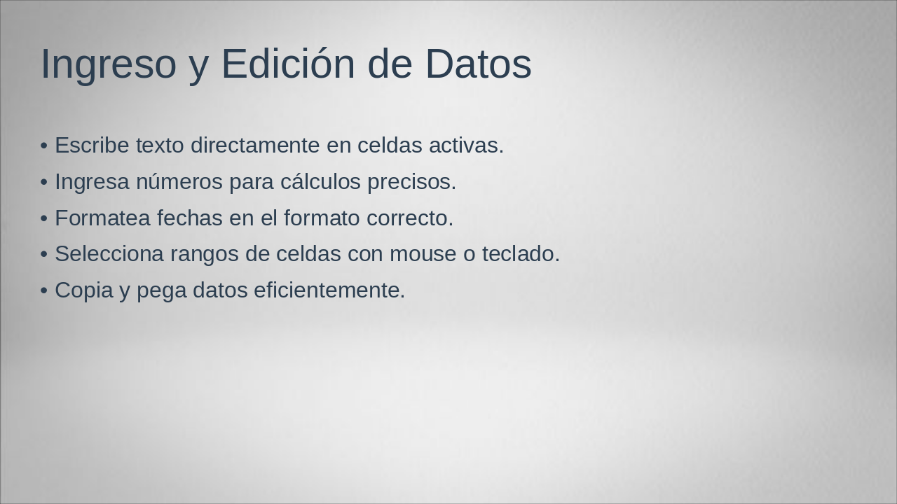
This slide on "Data Entry and Editing" explains how to input text directly into active cells, enter numbers for accurate calculations, and format dates correctly. It also covers selecting cell ranges using the mouse or keyboard, along with efficient copying and pasting of data.
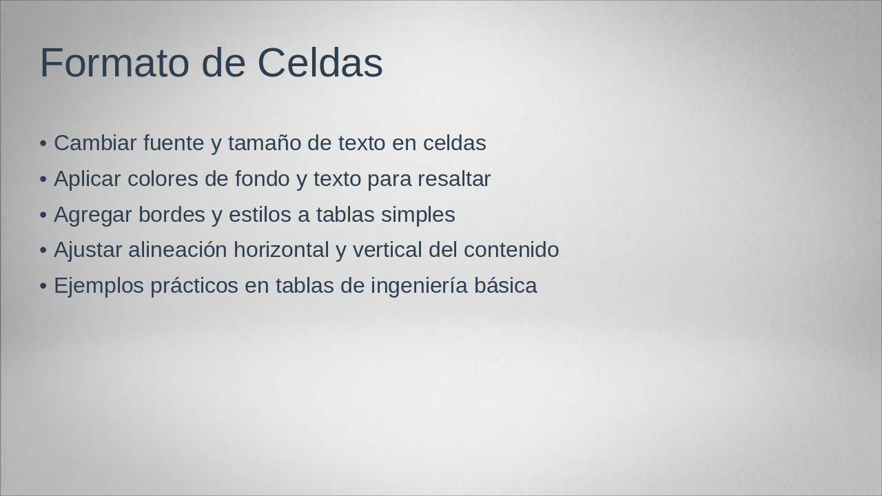
This slide on "Formato de Celdas" outlines key techniques for formatting cells in spreadsheets, including changing font and text size, applying background and text colors for emphasis, adding borders and styles to simple tables, and adjusting horizontal and vertical content alignment. It concludes with practical examples applied to basic engineering tables.
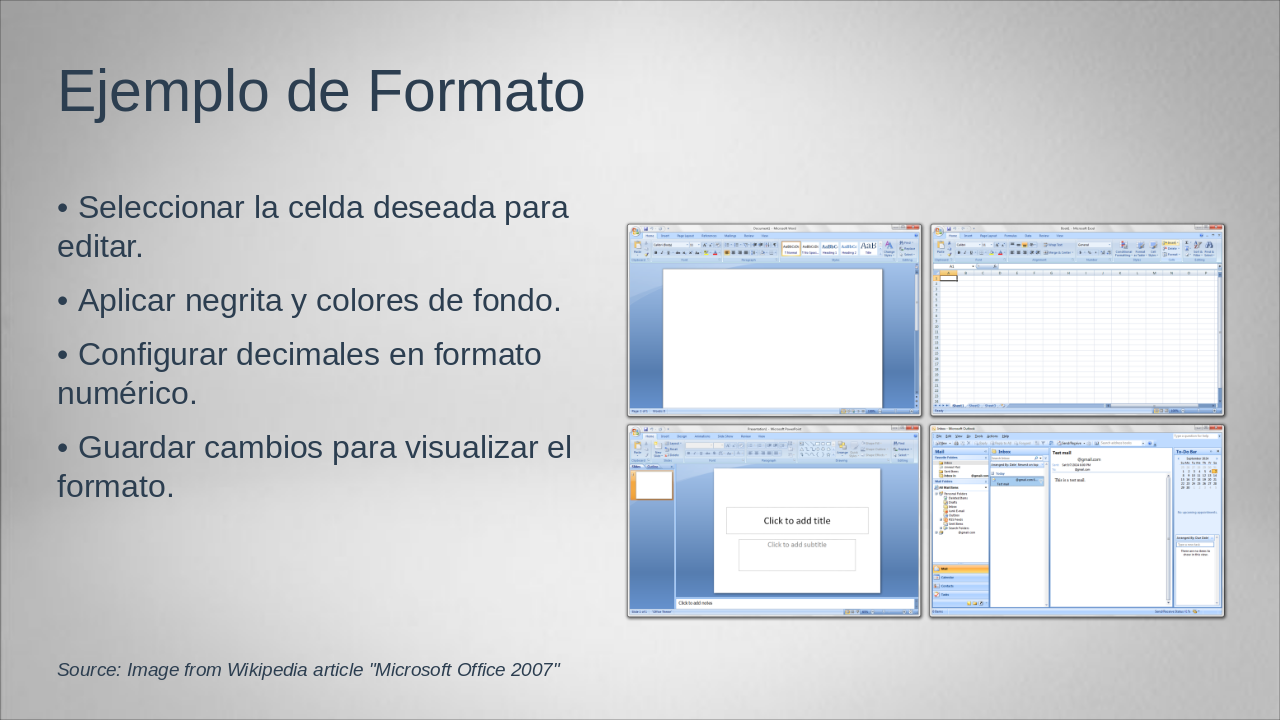
This slide, titled "Ejemplo de Formato," illustrates a sample format for editing cells in a spreadsheet or similar tool. It outlines key steps: selecting the desired cell to edit, applying bold text and background colors, configuring decimal places in numeric format, and saving changes to view the applied formatting.
Source: Image from Wikipedia article "Microsoft Office 2007"
This section header slide introduces "Tema 3" on basic functions and useful formulas in Excel for engineering students. It focuses on exploring essential functions like SUM and AVERAGE for engineering calculations.
Tema 3
Explorando SUMA, PROMEDIO y otras funciones esenciales para cálculos ingenieriles
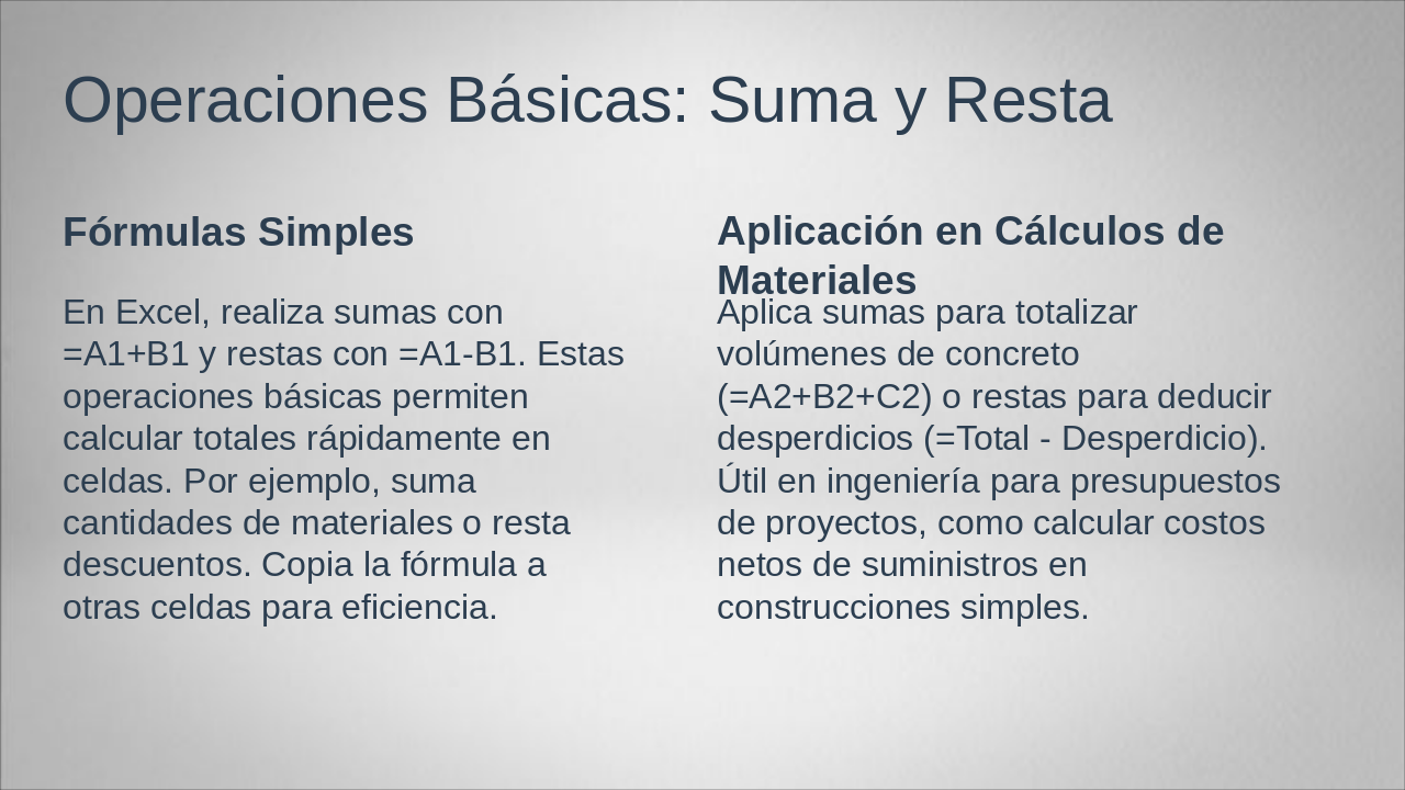
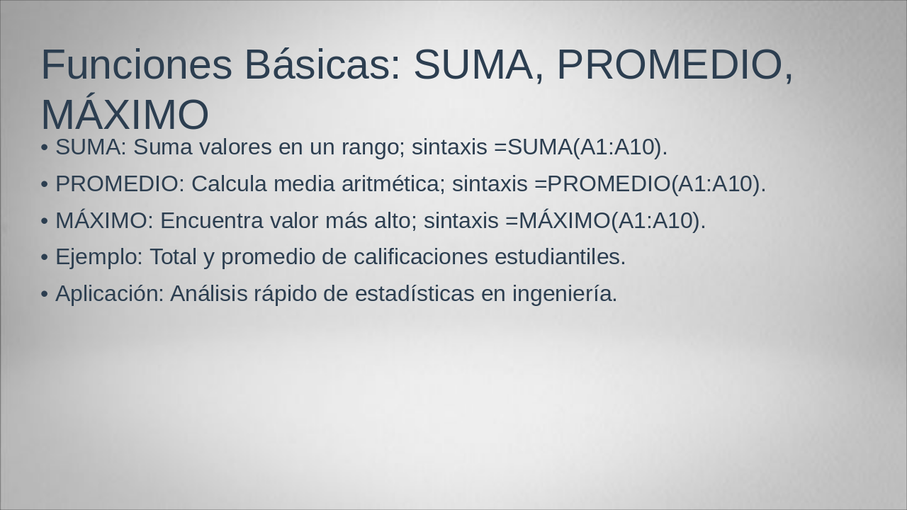
The slide covers basic Excel functions for data analysis: SUMA to add values in a range like =SUMA(A1:A10), PROMEDIO to calculate the arithmetic mean like =PROMEDIO(A1:A10), and MÁXIMO to find the highest value like =MÁXIMO(A1:A10). It includes an example of computing total and average student grades, with applications in quick statistical analysis for engineering.
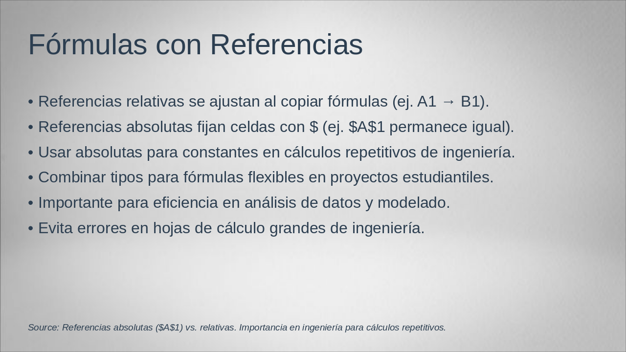
Relative references in formulas adjust automatically when copied, such as changing A1 to B1, while absolute references are fixed using dollar signs, like $A$1, to keep cells unchanged. Combining both types enhances flexibility in engineering calculations, data analysis, and modeling, preventing errors in large spreadsheets and improving efficiency for repetitive tasks or student projects.
Source: Referencias absolutas ($A$1) vs. relativas. Importancia en ingeniería para cálculos repetitivos.
The slide titled "Ejemplo de Fórmula" illustrates the Excel formula =PROMEDIO(B2:B10), which calculates the average of values in the specified cell range and displays the mean result. It highlights a common error of selecting the wrong cell range and advises always starting the formula with the equals sign (=) to avoid issues.
Source: Microsoft Excel

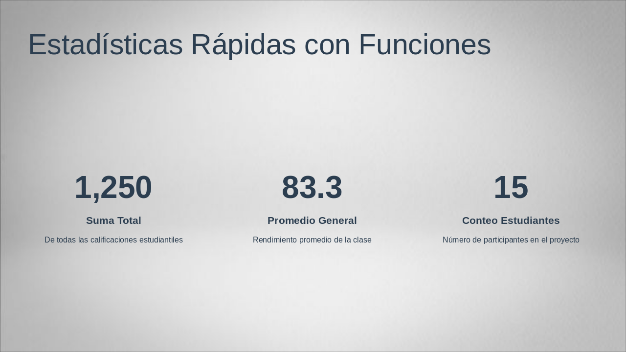
This slide, titled "Estadísticas Rápidas con Funciones," presents key classroom statistics derived from student grades. It highlights a total sum of 1,250 across all grades, an average performance of 83.3, and participation from 15 students in the project.
De todas las calificaciones estudiantiles
Rendimiento promedio de la clase
Número de participantes en el proyecto
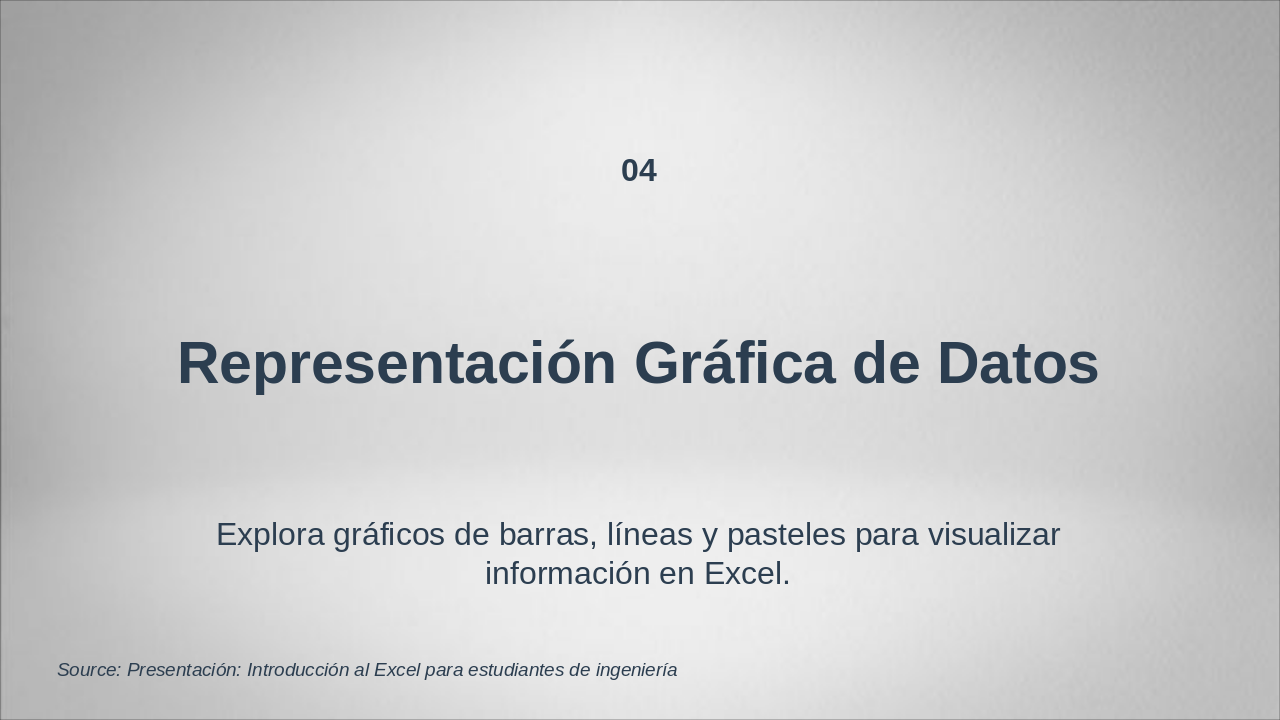
This section header slide introduces Topic 4 on the Graphical Representation of Data in Excel. It explores the use of bar charts, line graphs, and pie charts to effectively visualize information.
04
Explora gráficos de barras, líneas y pasteles para visualizar información en Excel.
Source: Presentación: Introducción al Excel para estudiantes de ingeniería
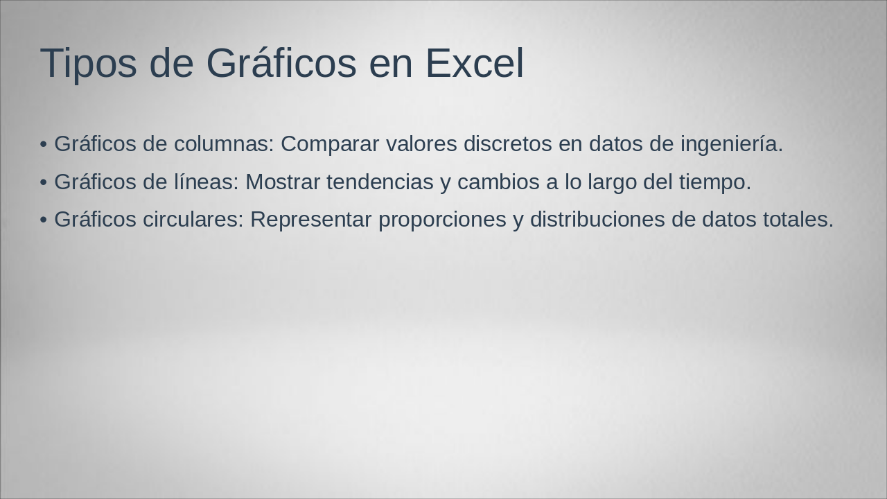
Excel's chart types include column charts, which compare discrete values in engineering data; line charts, which illustrate trends and changes over time; and pie charts, which represent proportions and distributions of total data. This slide outlines these fundamental options for visualizing data effectively in spreadsheets.
The slide titled "Creación de un Gráfico de Barras" outlines the steps to create a bar chart in a spreadsheet. It instructs to first select relevant data, then go to the Insert tab and choose the Bar Chart option, followed by customizing axes, labels, and formatting for better clarity.
Source: Image from Wikipedia article "Microsoft Office"
Personalizing graphs involves adding clear titles to identify their purpose, including legends to explain data series, and customizing colors to enhance visualization and appeal. It also covers adjusting line styles and markers for precision, with examples like applying these to physics experiment data to highlight trends, and saving changes for reuse in engineering reports.
The slide compares the advantages of graphics and tables in presenting data, particularly in engineering reports. Graphics are ideal for quickly visualizing trends, patterns, comparisons, and relationships to make complex information intuitive and engaging, while tables should be used for precise numerical details, raw data, technical specifications, or exact comparisons requiring close inspection.
| Ventajas de los Gráficos | Cuándo Usar Tablas |
|---|---|
| Los gráficos facilitan la comprensión rápida de tendencias y patrones en los datos. Son ideales para resaltar comparaciones, distribuciones y relaciones visuales. En informes de ingeniería, ayudan a comunicar resultados complejos de manera intuitiva y atractiva para el público. | Usa tablas cuando necesites precisión numérica exacta, como en cálculos detallados o listas de valores específicos. En informes de ingeniería, son esenciales para presentar datos crudos, especificaciones técnicas o comparaciones exactas que requieren lectura detallada. |
This section header slide introduces Topic 5 on practical applications of Excel in student engineering life. It focuses on real-world scenarios, such as budgeting and data analysis relevant to engineering studies.
05
Escenarios reales: presupuestos y análisis de datos en ingeniería estudiantil

This slide on School Project Management outlines practical Excel-based tools for effective planning and execution. It covers scheduling projects with tables, budgeting via formulas, tracking tasks with checklists, visualizing progress through charts, and coordinating engineering teams with shared data.

The slide outlines a step-by-step timeline for data analysis in an engineering experiment, starting with Step 1: collecting and organizing data in Excel columns for structured input. It continues through Step 2: applying basic formulas like SUM and AVERAGE for initial statistics, Step 3: creating visual graphs such as bars or lines to show trends, and Step 4: interpreting the results to draw useful conclusions.
Paso 1: Recopilar y Organizar Datos Recolecta información del experimento en Excel, ingresando valores en columnas para un análisis ordenado. Paso 2: Aplicar Fórmulas Básicas Usa funciones como SUMA y PROMEDIO para calcular estadísticas iniciales de los datos recolectados. Paso 3: Crear Gráficos Visuales Genera gráficos de barras o líneas para representar tendencias y patrones en los datos. Paso 4: Interpretar Resultados Finales Analiza los gráficos y cálculos para extraer conclusiones útiles del experimento en ingeniería.
This slide presents a practical example of calculating costs in a project, targeted at high school students, using Excel's SUM formula to total material expenses. It demonstrates automatic cost computation through references to variable data cells for dynamic updates.
Source: Image from Wikipedia article "Spreadsheet"

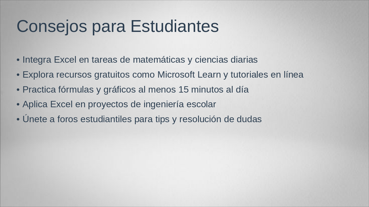
This slide offers practical tips for students to enhance their skills in Excel, such as integrating it into daily math and science tasks, exploring free resources like Microsoft Learn and online tutorials, and practicing formulas and charts for at least 15 minutes a day. It also encourages applying Excel to school engineering projects and joining student forums for tips and doubt resolution.
The slide, titled "Cita Motivadora," features an inspirational quote about Excel as a powerful tool for solving real-world engineering problems, encouraging users to master it and turn ideas into practical solutions. The quote is attributed to Dr. Ana López, an expert in data and engineering.
> Excel es una herramienta poderosa para resolver problemas reales en ingeniería. Aprende a usarla y transforma tus ideas en soluciones prácticas.
— Dr. Ana López, Experta en Datos e Ingeniería

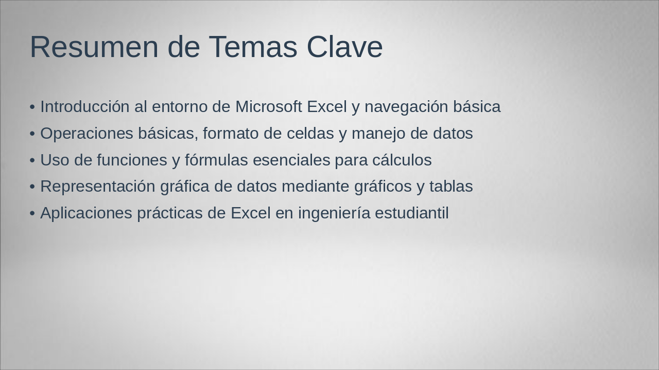
This slide, titled "Resumen de Temas Clave," outlines key topics in a Microsoft Excel tutorial, starting with an introduction to the environment and basic navigation. It then covers essential operations like cell formatting and data handling, core functions and formulas for calculations, data visualization through charts and tables, and practical applications for student engineering tasks.
The slide titled "Conclusión y Próximos Pasos" concludes that Excel facilitates learning in engineering. It recommends practicing with exercises and exploring advanced functions, ending with a thank you.
Excel facilita el aprendizaje en ingeniería.
Practica con ejercicios y explora funciones avanzadas. ¡Gracias!

Explore thousands of AI-generated presentations for inspiration
Generate professional presentations in seconds with Karaf's AI. Customize this presentation or start from scratch.