Slide 1 of 7
Slide 1 - Title Slide
Design Considerations of Student Dashboard
Sofonias Eshetu, Class 11A
---
Photo by Luke Chesser on Unsplash

Generated from prompt:
create my presentation explain my presentation is " design considerations" for student dashboard : simple and clean interface, responsive design, easy navigation and user-friendly layout. use contents, introductions, objectives, conclusion. add make full screen 3 screenshot image for explain . use on slide screen shot images donot use text use explained for arrow of 3 sub topics ok. Every screen shot must be explained on each topic, including full screen images like buttons . for first slide use presentation title= Design Considerations of Student Dashboard, name= Sofonias Eshetu, class=11A. second slide= table of contents : simple clean interface, responsive design, easy navigation, conclusion. third slide= explain simple clean interface fourth slide= explain responsive design fifth slide= explain easy navigation sixth slide= conclusion seventh slide= thank for attention : any questions or comment. use define and 3 main components for sub main topics
This presentation outlines essential design considerations for student dashboards, focusing on simple and clean interfaces, responsive design across devices, easy navigation, and their impact on student engagement and efficiency.
Design Considerations of Student Dashboard
Sofonias Eshetu, Class 11A
---
Photo by Luke Chesser on Unsplash
---
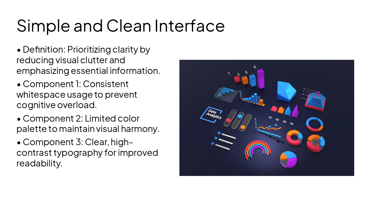
Photo by Martin Martz on Unsplash

---
Photo by Deng Xiang on Unsplash
Conclusion
Effective design improves student engagement and academic efficiency.
Thank you for your attention!
Thank you for your time. Do you have any questions or comments?

Explore thousands of AI-generated presentations for inspiration
Generate professional presentations in seconds with Karaf's AI. Customize this presentation or start from scratch.