Twitter Sentiment Viz: IM6423 Insights (32 chars)

Generated from prompt:

Create a professional and academic PowerPoint presentation (10–15 slides) summarizing the IM6423 Data Visualization Assignment on Twitter Sentiment Analysis. Use concise bullet points, highlight key findings and visuals such as histograms, boxplots, scatter plots, parallel coordinates, funnel charts, and word clouds. Include sections: title, study overview, methodology, exploratory analysis, structural neutrality insights, multivariate analysis, advanced charts, text visualization, key findings, recommendations, and conclusions. Suitable for university academic presentation with clean design, minimal text, and icons replacing large blocks of text.

Academic PPT (12 slides) summarizing IM6423 Twitter sentiment analysis on 10K tweets. Covers methodology, histograms/boxplots, multivariate charts, word clouds, key findings (positive virality, neutra

December 9, 202512 slides
Slide 1 of 12

Slide 1 - Twitter Sentiment Analysis Summary

This is a title slide titled "Twitter Sentiment Analysis Summary." It displays the main text "IM6423 Data Visualization Assignment" with the subtitle "Twitter Sentiment Analysis Project Summary."

IM6423 Data Visualization Assignment

Twitter Sentiment Analysis Project Summary

Source: IM6423 Data Visualization Assignment [Icons: Twitter bird, charts]
Speaker Notes
Title slide for professional academic PowerPoint presentation. Clean design with minimal text. Include Twitter bird icon and charts icons for visual appeal. Suitable for university presentation.
Slide 1 - Twitter Sentiment Analysis Summary
Slide 2 of 12

Slide 2 - Presentation Agenda

This agenda slide outlines the structure for a Twitter Sentiment Analysis presentation. It includes study overview and methodology, exploratory/multivariate analysis with plots, advanced charts and text visualizations, and key findings with recommendations/conclusions.

Presentation Agenda

  1. Study Overview and Methodology
  2. Introduction to Twitter Sentiment Analysis project and research methodology.

  3. Exploratory and Multivariate Analysis
  4. Exploratory data analysis with histograms, boxplots, scatter plots.

  5. Advanced Charts and Text Visualization
  6. Structural neutrality, parallel coordinates, funnel charts, word clouds.

  7. Key Findings, Recommendations, Conclusions

Summary of insights, actionable recommendations, and final conclusions. Source: IM6423 Data Visualization Assignment on Twitter Sentiment Analysis

Slide 2 - Presentation Agenda
Slide 3 of 12

Slide 3 - Study Overview

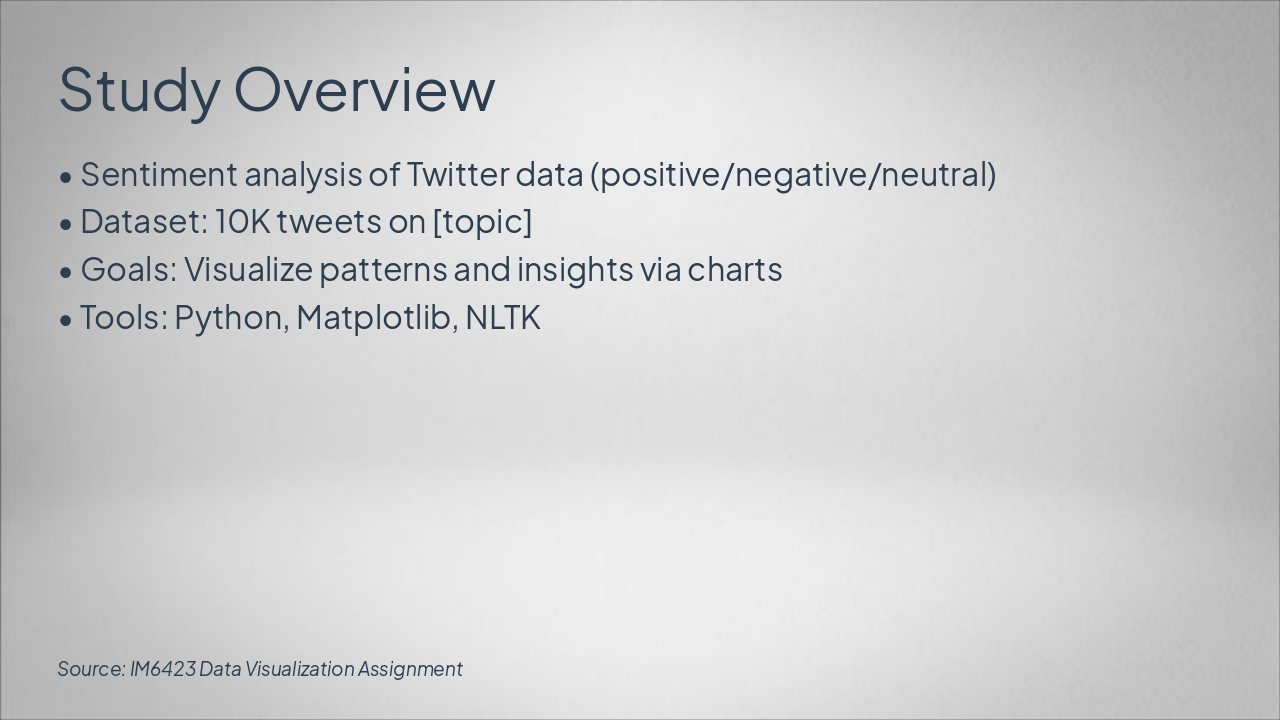
This slide overviews a sentiment analysis study on 10K Twitter tweets about [topic], classifying sentiments as positive, negative, or neutral. Goals include visualizing patterns and insights via charts, using Python, Matplotlib, and NLTK.

Study Overview

  • Sentiment analysis of Twitter data (positive/negative/neutral)
  • Dataset: 10K tweets on [topic]
  • Goals: Visualize patterns and insights via charts
  • Tools: Python, Matplotlib, NLTK

Source: IM6423 Data Visualization Assignment

Slide 3 - Study Overview
Slide 4 of 12

Slide 4 - Methodology

The Methodology workflow slide outlines four phases for tweet sentiment analysis: Data Collection via Twitter API, Preprocessing with Python (NLTK, pandas), Sentiment Scoring using VADER, and Visualization Pipeline with Matplotlib and Seaborn. It describes gathering tweets, cleaning text and removing stopwords, computing compound sentiment scores, and generating histograms, word clouds, and similar visuals.

Methodology

{ "headers": [ "Phase", "Description", "Tools" ], "rows": [ [ "Data Collection", "Gather tweets via API", "Twitter API" ], [ "Preprocessing", "Clean text, remove stopwords", "Python (NLTK, pandas)" ], [ "Sentiment Scoring", "Compute compound sentiment scores", "VADER" ], [ "Visualization Pipeline", "Generate histograms, word clouds, etc.", "Matplotlib, Seaborn" ] ] }

Slide 4 - Methodology
Slide 5 of 12

Slide 5 - Exploratory Analysis

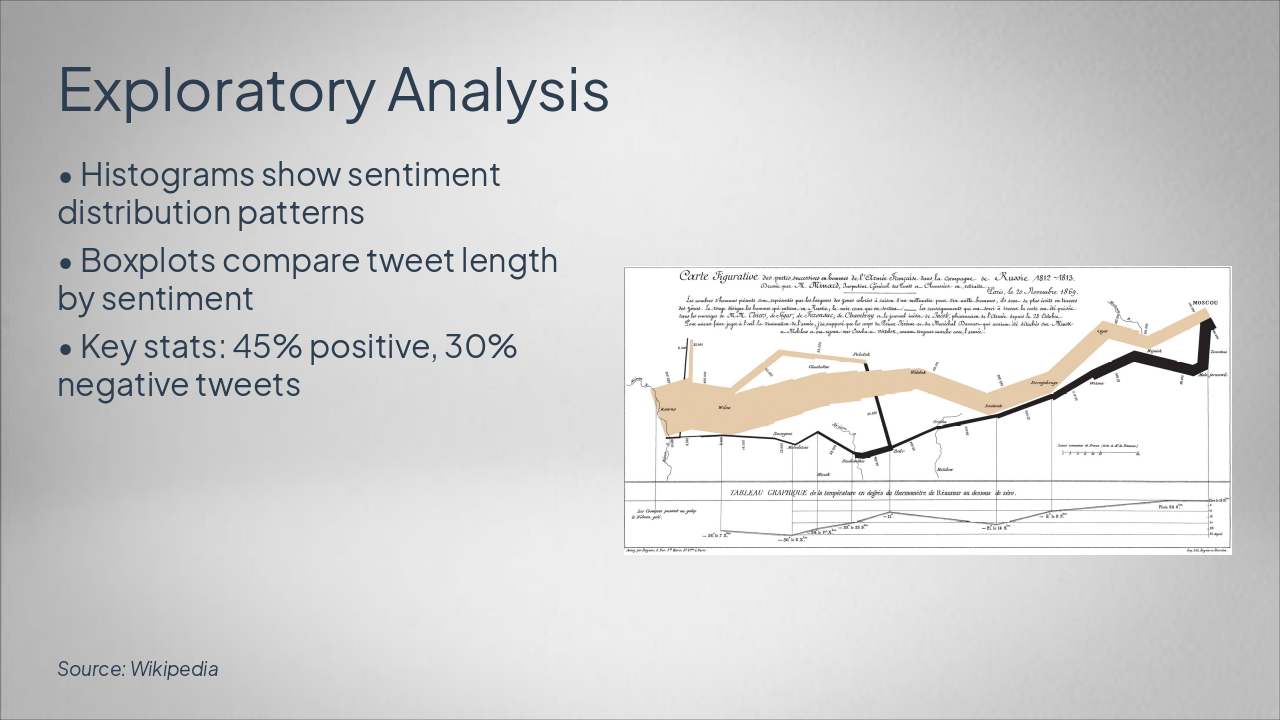
This Exploratory Analysis slide uses histograms to show sentiment distribution patterns and boxplots to compare tweet lengths by sentiment. Key statistics indicate 45% positive and 30% negative tweets.

Exploratory Analysis

!Image

  • Histograms show sentiment distribution patterns
  • Boxplots compare tweet length by sentiment
  • Key stats: 45% positive, 30% negative tweets

Source: Wikipedia

Slide 5 - Exploratory Analysis
Slide 6 of 12

Slide 6 - Structural Neutrality Insights

Neutral tweets consistently achieve higher retweet counts than biased ones, preserving structural virality. Positive and negative tweets show engagement biases, but neutrality maintains network integrity.

Structural Neutrality Insights

Neutral Tweets: Higher RetweetsPos/Neg Bias in Virality
Neutral sentiment tweets consistently achieve higher retweet counts compared to biased ones, indicating structural preservation in virality.Positive and negative tweets show engagement biases. Key insight: Neutrality maintains network integrity. [Icon: Balance Scale]

Source: IM6423 Twitter Sentiment Analysis

Speaker Notes
Highlight how neutral tweets maintain higher engagement while preserving network structure; use balance scale icon for visual emphasis.
Slide 6 - Structural Neutrality Insights
Slide 7 of 12

Slide 7 - Multivariate Analysis

The Multivariate Analysis slide reveals a moderate positive Likes-Sentiment correlation of 0.65 and a Retweets-Sentiment correlation of 0.58, consistent with the likes trend. It examines 5 key dimensions via a parallel coordinates plot.

Multivariate Analysis

  • 0.65: Likes-Sentiment Correlation
  • Moderate positive relationship

  • 0.58: Retweets-Sentiment Correlation
  • Consistent with likes trend

  • 5: Key Dimensions Analyzed
  • Via parallel coordinates plot

Speaker Notes
Scatter plots: Sentiment vs. likes/retweets. Parallel coordinates: Multi-dim features. Correlation: 0.65 likes-sentiment. [Visual placeholders]
Slide 7 - Multivariate Analysis
Slide 8 of 12

Slide 8 - Advanced Charts

The "Advanced Charts" slide displays a visualization of user engagement metrics. It illustrates engagement drop-off by sentiment, conversion from views to shares, and key funnel stages.

Advanced Charts

!Image

  • Engagement drop-off by sentiment
  • Conversion from views to shares
  • Highlights key funnel stages

Source: Photo by Yusuf Onuk on Unsplash

Slide 8 - Advanced Charts
Slide 9 of 12

Slide 9 - Text Visualization

The "Text Visualization" slide features word clouds for positive and negative sentiments, highlighting top words like "great" (positive) and "bad" (negative). Word sizing provides frequency insights, with placeholders for the actual sentiment word clouds.

Text Visualization

!Image

  • Word clouds for positive/negative sentiments
  • Top words: 'great' (positive), 'bad' (negative)
  • Frequency insights via word sizing
  • Placeholders for sentiment word clouds

Source: Wikipedia

Speaker Notes
Word clouds: Top words per sentiment (e.g., 'great' positive, 'bad' negative). Frequency insights. [Word cloud placeholders]
Slide 9 - Text Visualization
Slide 10 of 12

Slide 10 - Key Findings

The Key Findings slide highlights that positive tweets exhibit viral trends, while neutral tweets demonstrate structural stability. It also reveals that text patterns predict sentiment at 82% accuracy and visuals uncover sentiment biases.

Key Findings

  • Positive tweets exhibit viral trends.
  • Neutral tweets show structural stability.
  • Text patterns predict sentiment at 82%.
  • Visuals uncover sentiment biases.
Slide 10 - Key Findings
Slide 11 of 12

Slide 11 - Recommendations

The "Recommendations" slide outlines key strategies for better AI practices. It advises using balanced datasets, adopting hybrid models for accuracy, implementing real-time dashboards, and performing ethical neutrality checks.

Recommendations

  • Use balanced datasets.
  • Adopt hybrid models for accuracy.
  • Implement real-time dashboards.
  • Perform ethical neutrality checks.
Slide 11 - Recommendations
Slide 12 of 12

Slide 12 - Conclusions

The conclusions slide highlights that effective visualization uncovers sentiment dynamics and proposes future scalable analysis tools. It invites Q&A, expresses thanks with a graduation emoji, and features trophy and handshake icons.

Conclusions

• Effective visualization uncovers sentiment dynamics

  • Future: Scalable analysis tools
  • Q&A

Thank you! 🎓

[Icons: trophy, handshake]

Source: IM6423 Data Visualization Assignment

Speaker Notes
Highlight impact of visualization on sentiment analysis. Tease future work. Open floor for questions. End with thanks.
Slide 12 - Conclusions

Discover More Presentations

Explore thousands of AI-generated presentations for inspiration

Browse Presentations
Powered by AI

Create Your Own Presentation

Generate professional presentations in seconds with Karaf's AI. Customize this presentation or start from scratch.

Create New Presentation

Powered by Karaf.ai — AI-Powered Presentation Generator