Slide 1 of 18
Slide 1 - Title
+wellvyl Brand Identity
Brand Identity and Visual Strategy Deck
---
Photo by Boxed Water Is Better on Unsplash
Generated from prompt:
Brand Identity / Visual Identity Deck for +wellvyl based on https://wellvyl.com/. Slides: 1) Cover – +wellvyl Brand Identity. 2) Brand Overview – mission, vision, brand purpose. 3) Brand Story – what +wellvyl stands for in wellness/health. 4) Target Audience – demographics, psychographics, wellness-focused consumers. 5) Brand Positioning – where +wellvyl sits in the wellness market. 6) Brand Personality – tone, traits, archetype. 7) Logo Usage – primary logo, clear space, incorrect usage. 8) Color Palette – primary/secondary colors with usage guidance. 9) Typography – brand fonts and hierarchy. 10) Visual Style – photography direction, imagery mood, textures. 11) Graphic Elements – icons, shapes, patterns. 12) Social Media Look & Feel – examples of posts and layouts. 13) Website Style – UI direction and layout cues. 14) Packaging / Product Mockups – how brand appears on products. 15) Brand Voice & Messaging – tone of voice and sample copy. 16) Brand Guidelines Summary – key rules. 17) Future Brand Applications – campaigns, ads, digital assets. 18) Closing – building the +wellvyl brand.
Comprehensive brand identity deck for +wellvyl, a wellness community brand. Covers mission, vision, target audience, positioning, personality, logo usage, color palette, typography, visual style, graphic elements, social media, website, packaging,声 &
+wellvyl Brand Identity
Brand Identity and Visual Strategy Deck
---
Photo by Boxed Water Is Better on Unsplash
---
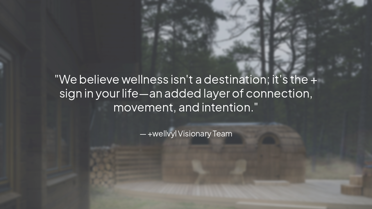
Photo by Sebastian Svenson on Unsplash
> We believe wellness isn't a destination; it's the + sign in your life—an added layer of connection, movement, and intention.
— +wellvyl Visionary Team
---
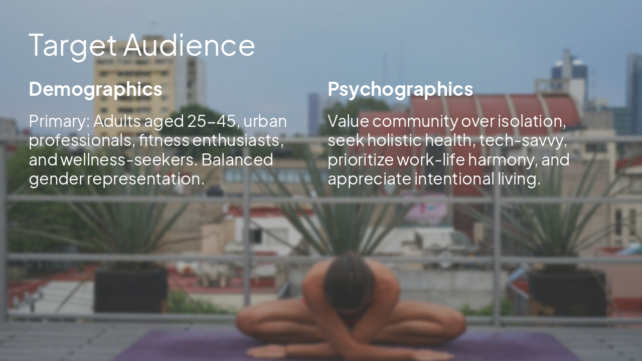
Photo by Iglucraft on Unsplash
Demographics Primary: Adults aged 25-45, urban professionals, fitness enthusiasts, and wellness-seekers. Balanced gender representation.
Psychographics Value community over isolation, seek holistic health, tech-savvy, prioritize work-life harmony, and appreciate intentional living.
---
Photo by Julie Ricard on Unsplash
---
Photo by Drew Beamer on Unsplash
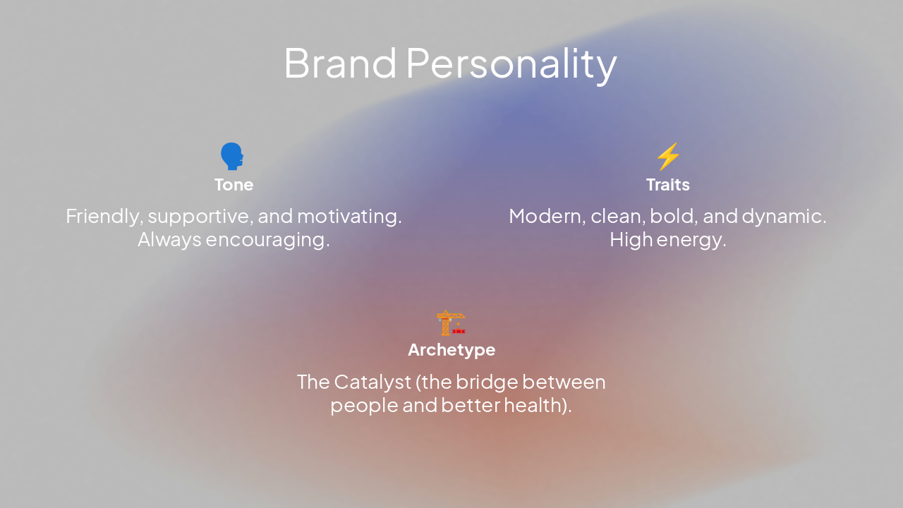
🗣️ Tone Friendly, supportive, and motivating. Always encouraging.
⚡ Traits Modern, clean, bold, and dynamic. High energy.
🏗️ Archetype The Catalyst (the bridge between people and better health).
---
Photo by Eve on Unsplash
---
Photo by Paul Sawyer on Unsplash Photo by ersan design on Unsplash
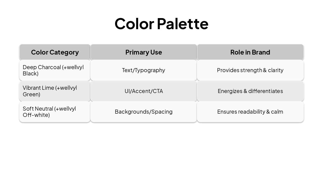
| Color Category | Primary Use | Role in Brand |
|---|---|---|
| Deep Charcoal (+wellvyl Black) | Text/Typography | Provides strength & clarity |
| Vibrant Lime (+wellvyl Green) | UI/Accent/CTA | Energizes & differentiates |
| Soft Neutral (+wellvyl Off-white) | Backgrounds/Spacing | Ensures readability & calm |
---
Photo by Oleg Laptev on Unsplash
---
Photo by Orlando García on Unsplash Photo by Karin Scholte on Unsplash
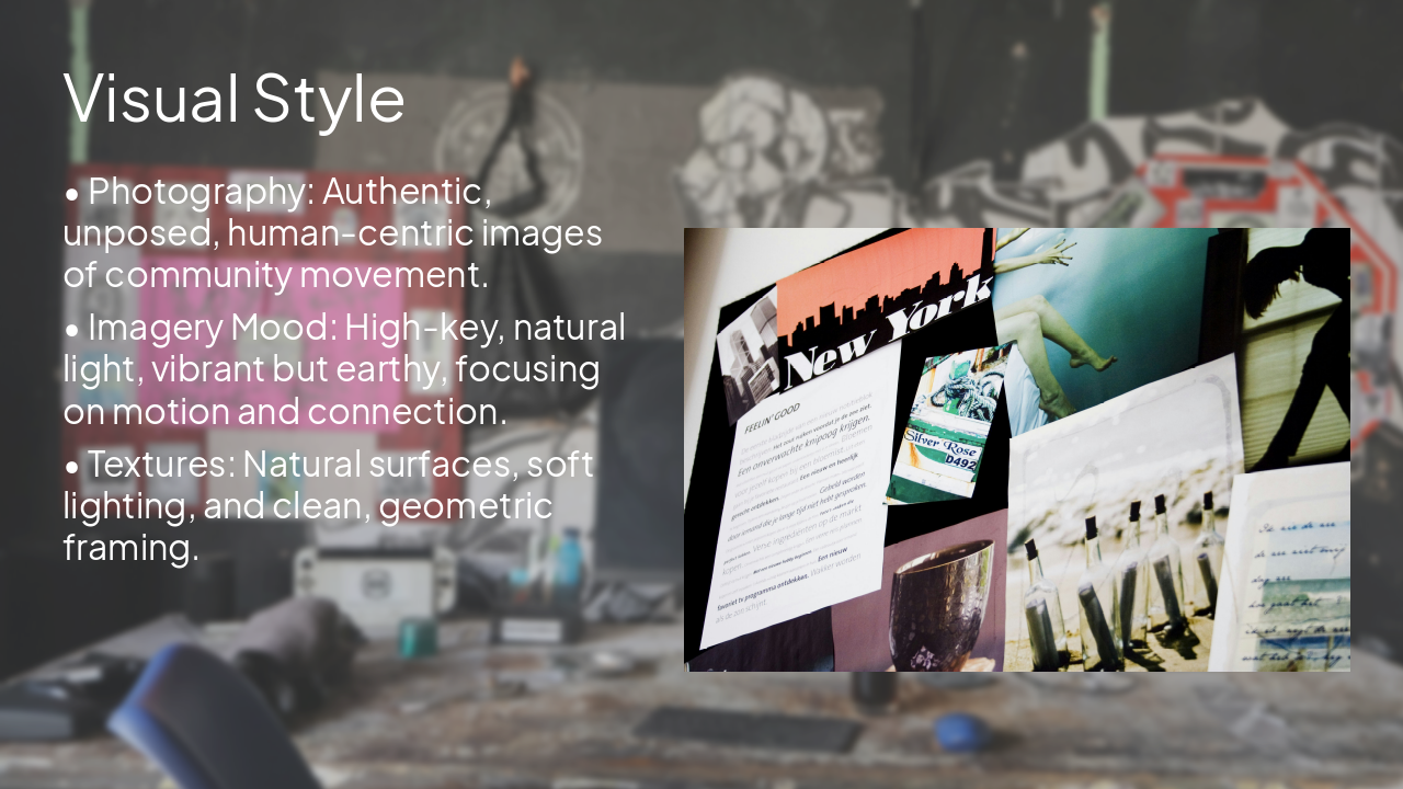
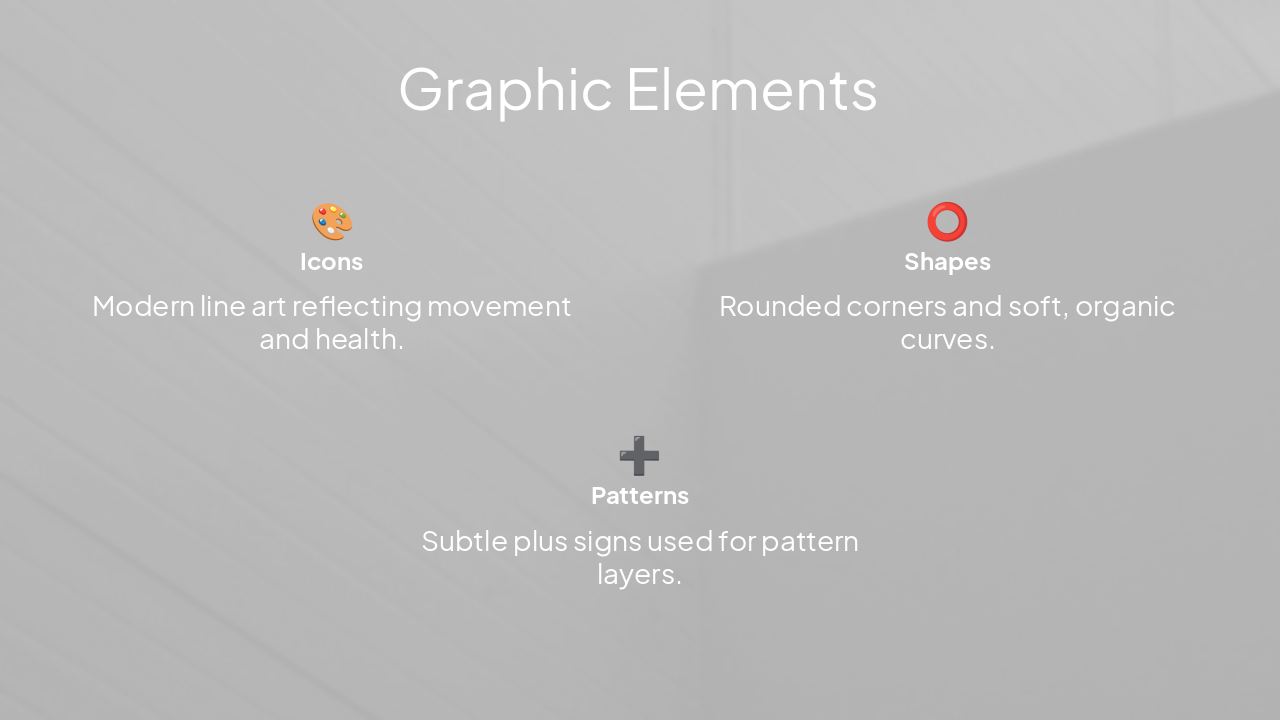
🎨 Icons Modern line art reflecting movement and health.
⭕ Shapes Rounded corners and soft, organic curves.
➕ Patterns Subtle plus signs used for pattern layers.
---
Photo by Oleg Laptev on Unsplash
---
Photo by Swello on Unsplash
---
Photo by Oleg Laptev on Unsplash
---
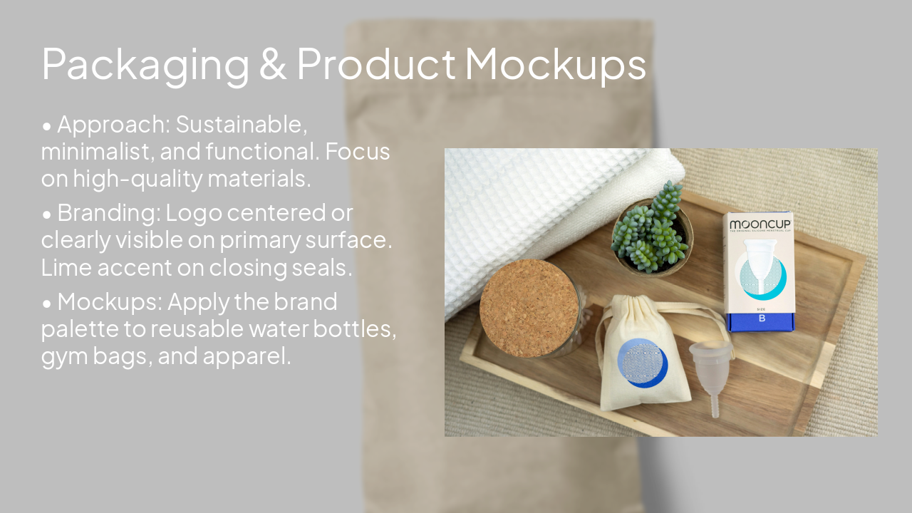
Photo by mockupbee on Unsplash Photo by Rebecca Manning on Unsplash
Voice Traits Positive, inclusive, human, and direct. Avoid jargon; emphasize community impact.
Sample Copy "Join the movement, find your flow. We make wellness simple, social, and for everyone."
---
Photo by Oleg Laptev on Unsplash
---
Photo by Oleg Laptev on Unsplash
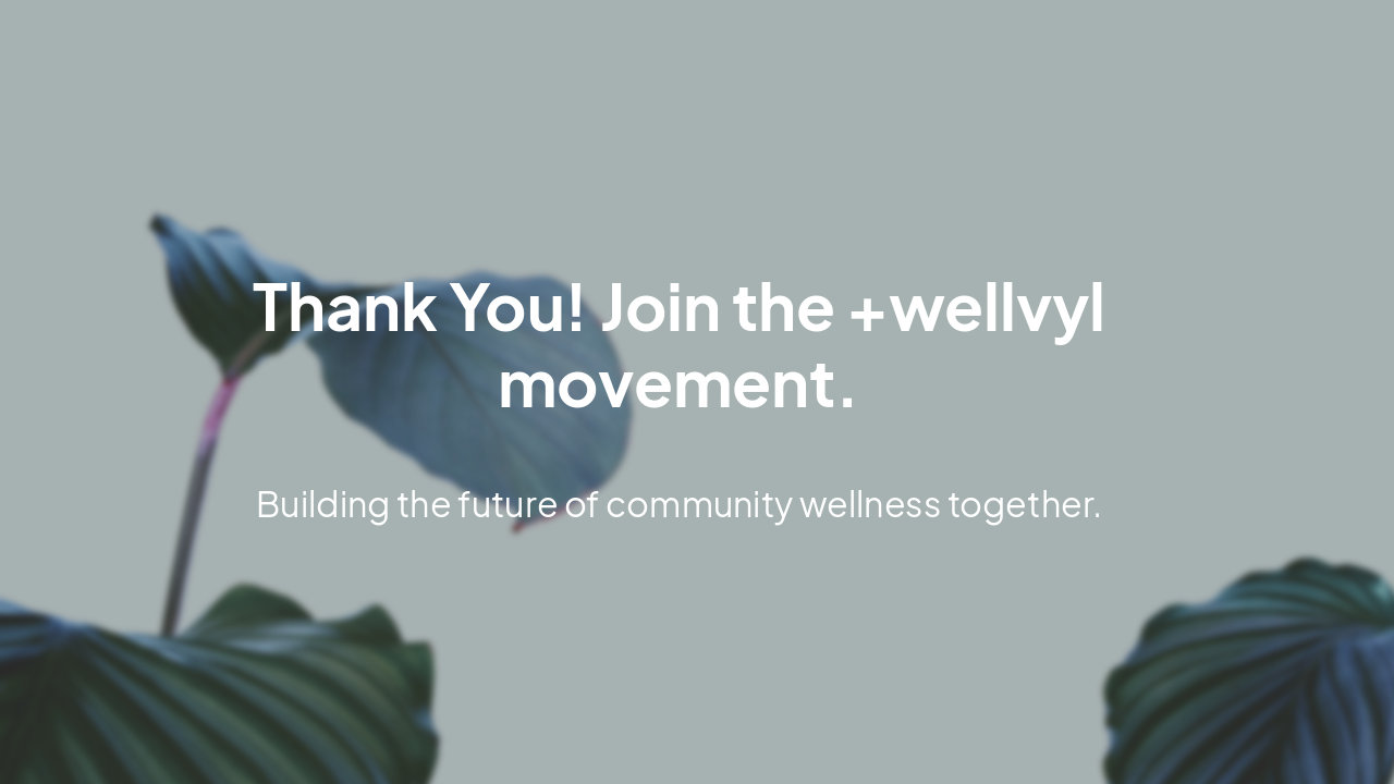
Thank You! Join the +wellvyl movement.
Building the future of community wellness together.
---
Photo by Ajit Singh on Unsplash
Explore thousands of AI-generated presentations for inspiration
Generate professional presentations in seconds with Karaf's AI. Customize this presentation or start from scratch.
