Mastering CRAP Design Principles

Generated from prompt:

Create a teaching presentation based on 'The Principles of Design' (Contrast, Repetition, Alignment, Proximity). Include: - Clear learning intentions and success criteria at the beginning - Guided notesheet sections for each principle (fill-in-the-blank, key definitions, examples) - Visual examples explanations - Practice/exit ticket questions - Simple, student-friendly language - حوالي 15-20 slides - Include a final guided notesheet printable slide

An educational introduction to the CRAP principles of design: Contrast, Repetition, Alignment, and Proximity. Covers definitions, real-world examples, applications for posters and presentations, learning objectives, success criteria, cheat sheet, and

April 11, 202615 slides
Slide 1 of 15

Slide 1 - Mastering the Principles of Design

Mastering the Principles of Design

An Introduction to CRAP Principles in Design
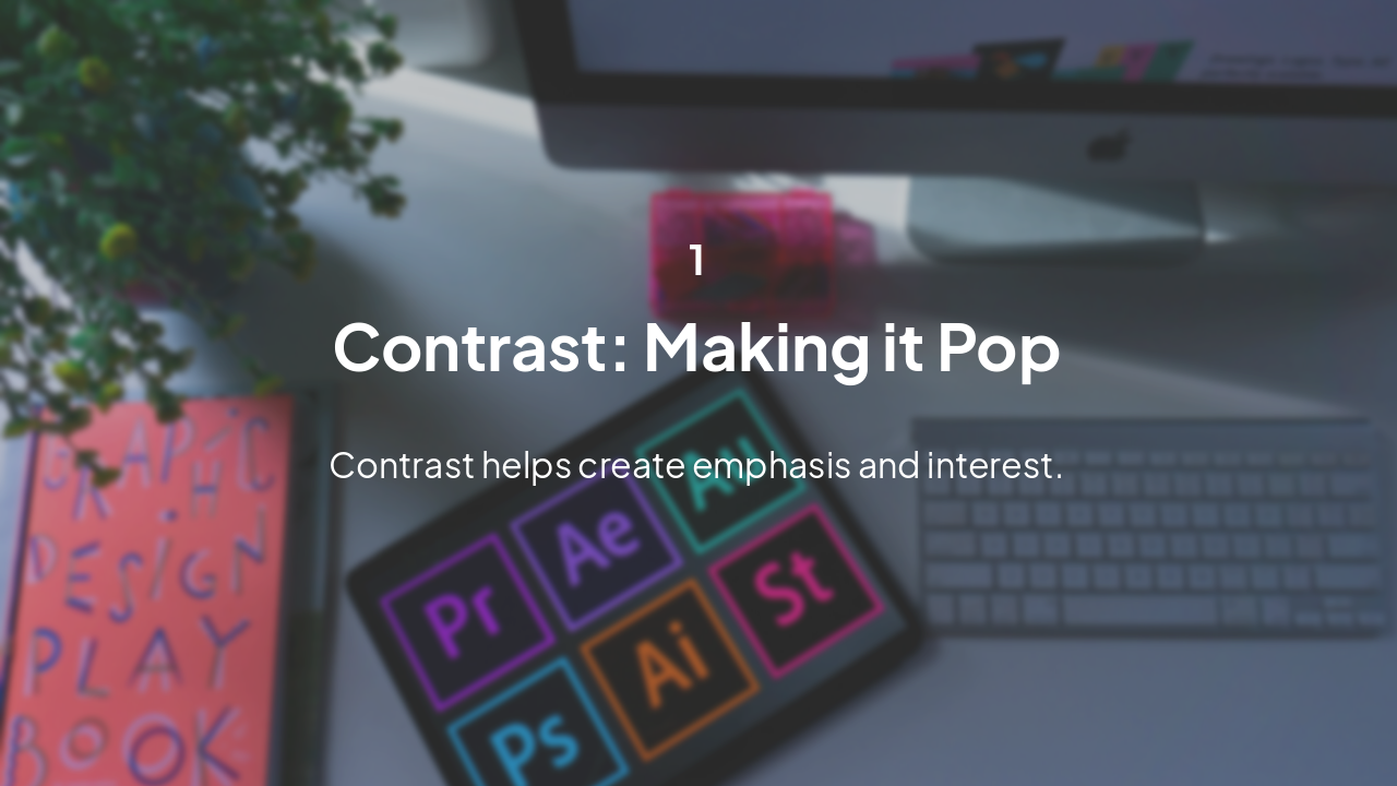
Slide 1 - Mastering the Principles of Design
Slide 2 of 15

Slide 2 - Learning Intentions

  • Understand the four fundamental principles of design: Contrast, Repetition, Alignment, and Proximity.
  • Explain how each principle impacts the visual clarity and professional look of a design.
  • Apply these principles to create better posters, presentations, and digital documents.
Slide 2 - Learning Intentions
Slide 3 of 15

Slide 3 - Success Criteria

  • I can define the four design principles (Contrast, Repetition, Alignment, Proximity).
  • I can identify examples of these principles in real-world designs.
  • I can improve a draft layout by applying at least two of these principles.
Slide 3 - Success Criteria
Slide 4 of 15

Slide 4 - Contrast

1

Contrast: Making it Pop

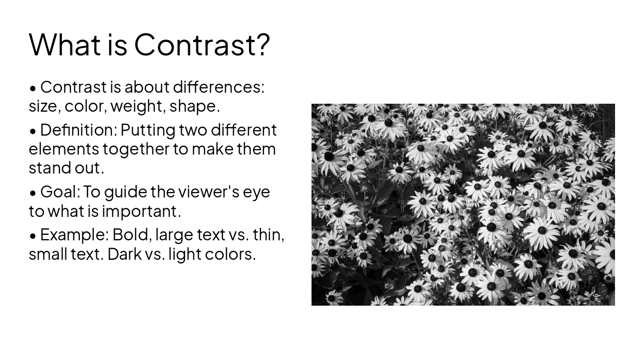
Contrast helps create emphasis and interest.

---

Photo by Emily Bernal on Unsplash

Slide 4 - Contrast
Slide 5 of 15

Slide 5 - What is Contrast?

  • Contrast is about differences: size, color, weight, shape.
  • Definition: Putting two different elements together to make them stand out.
  • Goal: To guide the viewer's eye to what is important.
  • Example: Bold, large text vs. thin, small text. Dark vs. light colors.

---

Photo by Ivona Rož on Unsplash

Slide 5 - What is Contrast?
Slide 6 of 15

Slide 6 - Repetition

2

Repetition: Creating Consistency

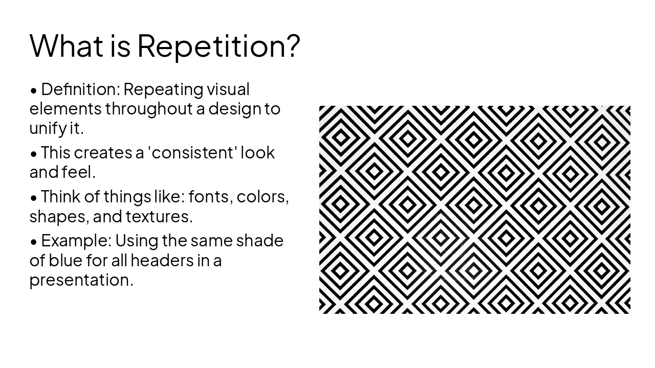
Repetition brings a design together.

---

Photo by Emily Bernal on Unsplash

Slide 6 - Repetition
Slide 7 of 15

Slide 7 - What is Repetition?

  • Definition: Repeating visual elements throughout a design to unify it.
  • This creates a 'consistent' look and feel.
  • Think of things like: fonts, colors, shapes, and textures.
  • Example: Using the same shade of blue for all headers in a presentation.

---

Photo by Akshar Dave🌻 (https://unsplash.com/@akshardave?utmsource=karaf&utmmedium=referral) on Unsplash (https://unsplash.com/?utmsource=karaf&utm_medium=referral)
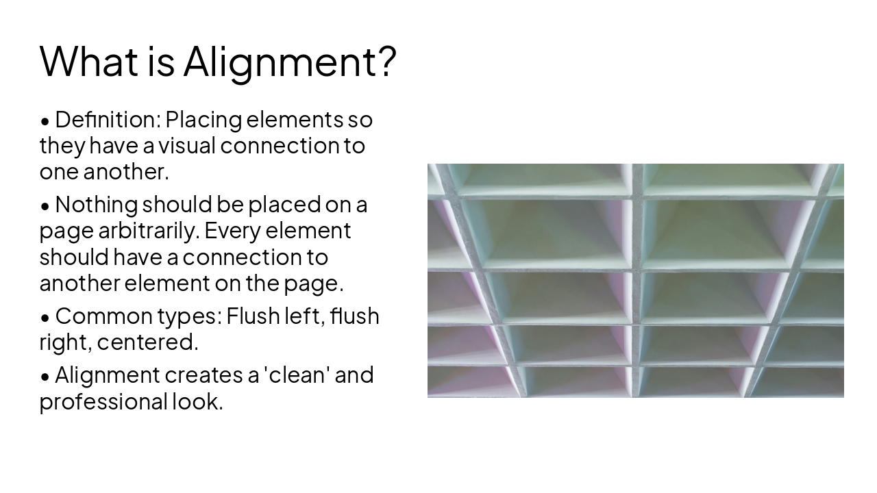
Slide 7 - What is Repetition?
Slide 8 of 15

Slide 8 - Alignment

3

Alignment: Bringing Order

Alignment organizes your content.

---

Photo by kimny on Unsplash

Slide 8 - Alignment
Slide 9 of 15

Slide 9 - What is Alignment?

  • Definition: Placing elements so they have a visual connection to one another.
  • Nothing should be placed on a page arbitrarily. Every element should have a connection to another element on the page.
  • Common types: Flush left, flush right, centered.
  • Alignment creates a 'clean' and professional look.

---

Photo by Shahabudin Ibragimov on Unsplash

Slide 9 - What is Alignment?
Slide 10 of 15

Slide 10 - Proximity

4

Proximity: Grouping Ideas

Proximity builds relationships.

---

Photo by Kelsey Todd on Unsplash
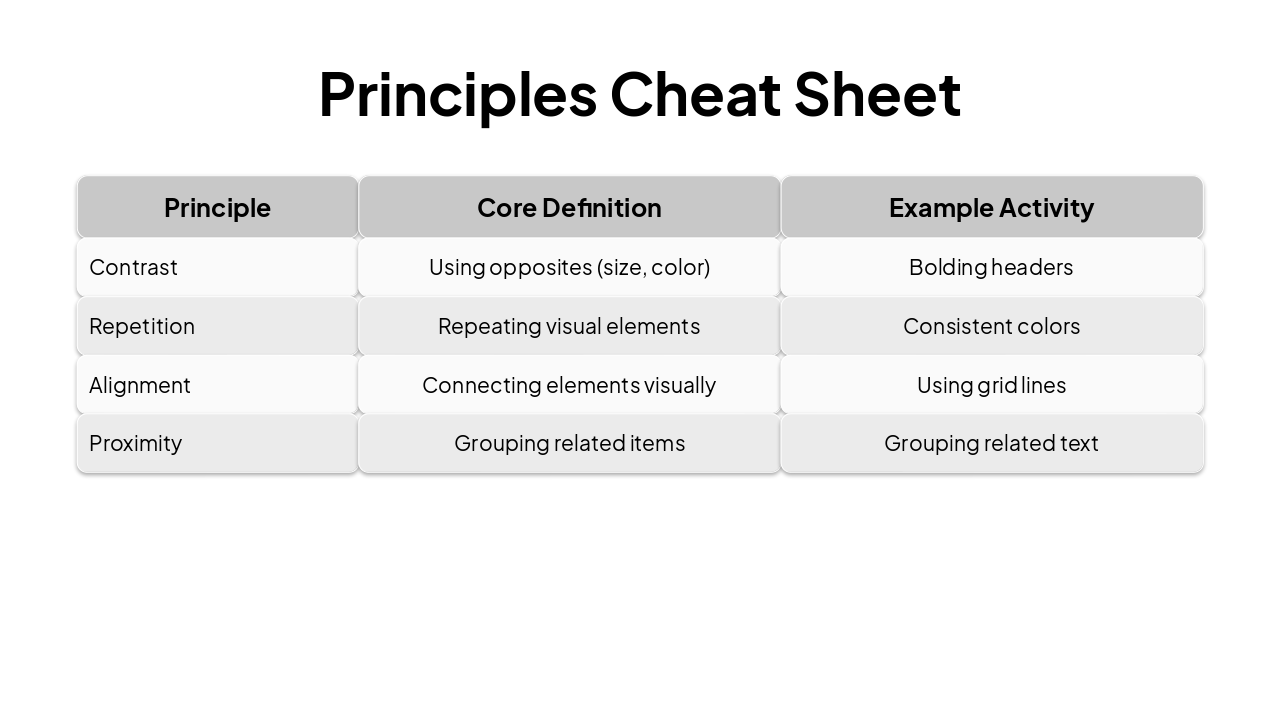
Slide 10 - Proximity
Slide 11 of 15

Slide 11 - What is Proximity?

  • Definition: Placing related items close together to group them into a single visual unit.
  • Items that are NOT related should be separated with white space.
  • This reduces clutter and makes the information easier to read.
  • Example: Keep the title of a paragraph near the paragraph itself.
Slide 11 - What is Proximity?
Slide 12 of 15

Slide 12 - Principles Cheat Sheet

PrincipleCore DefinitionExample Activity
ContrastUsing opposites (size, color)Bolding headers
RepetitionRepeating visual elementsConsistent colors
AlignmentConnecting elements visuallyUsing grid lines
ProximityGrouping related itemsGrouping related text
Slide 12 - Principles Cheat Sheet
Slide 13 of 15

Slide 13 - Exit Ticket Quiz

  • Q1: Which principle says that related items should be grouped together? (Answer: Proximity)
  • Q2: How can repetition make a poster look more professional? (Answer: Consistency/Unity)
  • Q3: If you have two different pieces of text, how do you make one stand out? (Answer: Contrast)
  • Q4: What is one way to create alignment in a document? (Answer: Use a grid or flush edges)
Slide 13 - Exit Ticket Quiz
Slide 14 of 15

Slide 14 - Guided Notesheet (Printable)

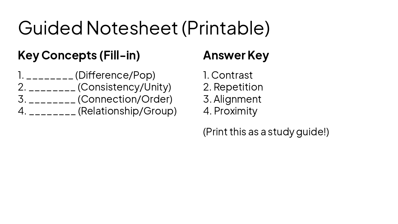
Key Concepts (Fill-in)

  1. (Difference/Pop)
  2. (Consistency/Unity)
  3. (Connection/Order)
  4. (Relationship/Group)

Answer Key

  1. Contrast
  2. Repetition
  3. Alignment
  4. Proximity

(Print this as a study guide!)

Slide 14 - Guided Notesheet (Printable)
Slide 15 of 15

Slide 15 - Summary & Conclusion

Great design is intentional. Remember the Principles!

Apply these to your next project!

---

Photo by Logan Voss on Unsplash

Slide 15 - Summary & Conclusion

Discover More Presentations

Explore thousands of AI-generated presentations for inspiration

Browse Presentations
Powered by AI

Create Your Own Presentation

Generate professional presentations in seconds with Karaf's AI. Customize this presentation or start from scratch.

Create New Presentation

Powered by Karaf.ai — AI-Powered Presentation Generator